
A list of 300+ CSS properties
There are more than 500 CSS properties but the browsers only support around 300+ properties. That's why we have prepared the list of 300 CSS properties with values which the current browsers support. This is not just a list. You can explore and practice each property.
CSS align-content
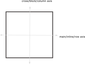
CSS align-content property aligns the content vertically (along cross/block/column axis) within a container. The container adjusts its padding so as to align the content vertically. We are using a flex container.
normalDefault
-
It stretches out the descendant elements to fill the height completely.
align-content: normal;
baseline
-
It aligns multiple objects (elements) on the same baseline such as cells within a row.
-
text-align: baseline;
center
-
It aligns the content elements in the middle of the container.
align-content: center;
stretch
-
It stretches all of the objects (elements) in such a way that they occupy the full height of the container.
align-content: stretch;
flex-start
-
flex-start aligns the content at the start of the flex container.
align-content: flex-start;
flex-end
-
flex-end aligns the content at the end of the flex container.
align-content: flex-end;
space-between
-
In this case, the first object is aligned at the start of the container and the last object is aligned at the end of the container. The remaining objects are placed in such a way that white space is distributed equally among any two objects.
align-content: space-between;
space-around
-
The objects are distributed in such a way that there is the same space between the objects except at the start and end of the container.
There is half sized space (half of the space that is between any two objects) before the first object and after the last object.
align-content: space-around;
space-evenly
-
It adjusts the alignment of objects so as to distribute equal space between and around the objects.
align-content: space-evenly;
CSS align-items
CSS align-items property controls the alignment of the child items vertically (along cross/block/column axis). We are using flex container.
normalDefault
-
It stretches out the child elements so as to fill the height of the container completely.
align-items: normal;
baseline
-
It aligns multiple objects (elements) on same baseline such as cells within a row.
align-items: baseline;
center
-
It aligns the content in the middle of the container.
align-items: center;
stretch
-
It stretches all of the objects (elements) in such a way that they occupy the full height of the container.
align-items: stretch;
flex-start
-
flex-start aligns the content at the start of flex container.
align-items: flex-start;
flex-end
-
flex-end aligns the content at the end of the flex container.
align-items: flex-end;
CSS align-self
CSS align-self property aligns itself vertically (cross/block/column axis) within its container by adjusting the margins. We are using flex container.
autoDefault
-
It stretches out the element vertically to fill the height of the container completely.
align-self: auto;
baseline
-
It aligns the element on the normal baseline.
align-self: baseline;
center
-
It aligns an element at the middle of cotainer.
align-self: center;
stretch
-
It stretches the element so as fill the height of container completely.
align-self: stretch;
flex-start
-
flex-start aligns the current element at the start of flex container.
align-self: flex-start;
flex-end
-
flex-end aligns the current element at the end of the flex container.
align-self: flex-end;
CSS animation
It is a shorthand property of animation-name, animation-duration, animation-delay, animation-direction, animation-iteration-count, animation-play-state, and animation-fill-mode.
animation : animation-name animation-duration animation-delay animation-direction animation-iteration-count animation-play-state animation-fill-mode animation-timing-function
CSS animation-delay
CSS animation-delay property delays the animation execution i.e. how much time delay between the animation start and its execution.
+ve value (seconds)Default
-
animation-delay accepts value in seconds. 0s means the animation starts its execution as soon as it starts.
animation-delay: 0s;
+ve fractional value (seconds)
-
animation-delay also accepts fractional values. 2.5s means the animation starts execution after 2.5 seconds when it is applied.
animation-delay: 2.5s;
+ve value (milliseconds)
-
value in milliseconds may also be used. 2000ms means 2s. It will start execution after 2s.
animation-delay: 2000ms;
-ve value (seconds)
-
It starts execution partway through its life cycle. If the animation-duration is 3s and animation-delay is -2s, it shows a part of the cycle in the remaining time i.e. you can see the part of the animation cycle for the last second.
animation-delay: -2s;
CSS animation-direction
CSS animation-direction property represents the direction of all or some animation cycles in the same or reverse direction.
In this case, all the animation timing functions such as ease-in, ease-out, ease-in-out are also reversed. For example, ease-in in normal direction becomes ease-out in the reverse direction.
normalDefault
-
represents normal direction of animation cycles.
animation-direction: normal;
reverse
-
represents animation cycles in the reverse direction.
animation-direction: reverse;
alternate
-
represents odd animation cycles in the normal direction while the even ones in reverse direction
In other words, 1, 3, and 5 will be in the normal direction while 2, 4, and 6 will be the reverse direction.
animation-direction: alternate;
alternate-reverse
-
It is exactly opposite to alternate i.e. odd animation cycles in the reverse direction while the even ones in the normal direction.
In other words, 1, 3, and 5 will be in the reverse direction while 2, 4, and 6 will be the normal direction.
animation-direction: alternate-reverse;
CSS animation-duration
CSS animation-duration property defines the total duration of one animation cycle. We take an example of animation with different values for animation-duration.
Negative values are not allowed.
+ve value (seconds)Default
-
This value determnines the duration of an animation cycle. 1s represents the duration in the demo.
animation-duration: 1s;
+ve value (seconds)
-
This value determnines the duration of an animation cycle. If the value is 0s, the animation occurs instantly for 0s.
animation-duration: 0s;
+ve fractional value (seconds)
-
The animation-duration also accepts fractional values. The animation can continue for 2.5s.
animation-duration: 2.5s;
+ve value (milliseconds)
-
time in milliseconds may also be used as the value. The animation continues for 2000ms i.e. 2s.
animation-duration: 2000ms;
CSS animation-fill-mode
It applies CSS properties to an element that are picked from the end of last animation cycle or from the start of first animation cycle during the idle time i.e. during the animation delay.
We take an example with 3s animation-duration and 1s animation-delay.
noneDefault
-
It does not apply CSS properties to the element during the idle time i.e. during the animation delay.
animation-fill-mode: none;
forwards
-
It applies property values that are picked from the end of the last completed animation cycle in case of more than one cycles (when animation-iteration-count>0).
If animation-iteration-count is 0, it applies CSS properties that are picked from the start of an animation cycle.
animation-fill-mode: forwards;
backwards
-
In this case, the applied properties are picked from the start of the first animation cycle.
These values are picked either from the 'from' in case of normal or 'to' in case of reverse.
animation-fill-mode: backwards;
both
-
It represents the effect of both forwards and backward i.e. the applied properties are picked from the start of the firs animation cycle and from the end of last animation cycle.
animation-fill-mode: both;
CSS animation-iteration-count
CSS animation-iteration-count property represents the number of times an animation cycle repeats itself.
+ve integerDefault
-
A positive integer represents the number of times an animation cycle repeats itself.
'1' means the animation completes its cycle only once from beginning to end.
animation-iteration-count: 1;
+ve fractional value
-
If there is a fractional value, the animation cycles repeat themselves completely for an integral part and partially for the fractional part. 1.5 means one and half of the cycle.
animation-iteration-count: 1.5;
infinite
-
The animation cycle repeats itself forever.
animation-iteration-count: infinite;
CSS animation-name
CSS animation-name property represents a list of one or more keyframe-names separated by comma. Each keyframe-name applies property values to an element.
We take an example of animation with one or more keyframe rules.
noneDefault
-
There will be no animation.
animation-name: none;
keyframe-name
-
It represents a @keyframe rule with keyframe-name consisting of time intervals and each time interval containing respective property values. We are using 'rotate' keyframe as the value of animation-name.
animation-name: rotate;
keyframe-name list
-
We can use more than one different keyframes as the value of animation-name. We are using 'rotate' and 'moveTo' keyframes as the value of animation-name.
If more than one keyframes are affecting the same CSS property, the last keyframe will override the previous ones.
animation-name: rotate, moveTo;
CSS animation-play-state
CSS animation-play-state property represents whether the animation is in a running or paused state.
runningDefault
-
It represents the running state of animation.
animation-play-state: running;
paused
-
When animation is paused, it continues applying property values that it made before pausing the animation (pausing the animation-duration or animation-delay).
When it is switched to running state, the animation starts its execution at the time interval (animation-duration or animation-delay resumes) where it was left off.
animation-play-state: paused;
CSS animation-timing-function
CSS animation-timing-function defines how the animation progress between different time intervals of a keyframe.
easeDefault
-
The speed of the animation is constant over its duration. It represents normal behavior over the animation-duration.
animation-timing-function: ease;
ease-in
-
The speed is slow at the start of animation i.e. It represents smooth behavior at the start only.
animation-timing-function: ease-in;
ease-out
-
The speed is fast at the end of animation i.e. The animation is smooth at the end.
animation-timing-function: ease-out;
ease-in-out
-
The speed of the animation is slow at the start and end of animation-duration as compared to intermediate time. It represents smooth behavior at the start and end of the animation.
animation-timing-function: ease-in-out;
CSS backface-visibility
CSS background is a shorthand property of background-position, background-image, background-size, background-repeat, background-attachment, and background-clip property.
The following syntax represents only one layer. We can get more layers by repeating the following syntax. These layers are separated with a comma.
visible Default
-
The back face is visible when it is rotated by 180 degrees.
backface-visibility: visibile;
hidden
-
The back face is not visible when it is rotated by 180 degrees.
backface-visibility: hidden;
CSS background
CSS background is a shorthand property of background-position, background-image, background-size, background-repeat, background-attachment, and background-clip property.
The following syntax represents only one layer. We can get more layers by repeating the following syntax. These layers are separated with a comma.
background : background-color background-image background-position / background-size background-repeat background-attachment background-origin background-clip
CSS background-attachment
CSS background-attachment property represents the position of background image for an element with respect to viewport (visible area of web page) or other content within the same element.
fixedDefault
-
The background is fixed with respect to both the content box and the viewport.
-
The background-image remains fixed with respect to both the box and the viewport.
background-attachment: fixed;
scroll
-
The background remains fixed with respect to the content box but scrolls with respect to viewport.
-
The background-image remains fixed with respect to the content box but does not remain fixed with respect to viewport.
background-attachment: scroll;
local
-
The background does not remain fixed with respect to both the content box and the viewport.
-
The background-image scrolls with respect to both content box and viewport.
background-attachment: local;
CSS background-blend-mode
This property blends multiple background images. It has the same values as mix-blend-mdoe. The background-image may consist of image url or gradient.
background-blend-mode : normal | multiply | screen | overlay | darken | lighten | color-dodge | color-burn | hard-light | soft-light | difference | exclusion | hue | saturation | color | luminosity
CSS background-clip
CSS background-clip property specifies the boundary of the background painting area.
border-boxDefault
-
In this case, the background of all of the areas within border-box is painted such as content area, padding area, and border area.
background-clip: border-box;
padding-box
-
In this case, the areas that are within padding-box are painted such as the padding and content areas.
background-clip: padding-box;
content-box
-
The only background of content-area is painted i.e. excluding the other two areas.
background-clip: content-box;
CSS background-color
CSS background-color property defines the background-color of an element.
color-nameDefault
-
Any name of the color can be used as the value of background-color. The default color of background is blue for an element.
background-color: transparent;
color-name
-
The following demo represents skyblue color for the background of an element.
background-color: skyblue;
rgb value
-
It represents rgb value of a color. The hexadecimal value of red color is given below.
background-color: rgb(255,0,0);
hexadecimal value
-
It represents hexadecimal notation of red color. The hexadecimal notation of blue color is given below.
background-color: #0000ff;
CSS background-image
CSS background-image property adds an image as the background of an element. More than one images can also be used (subsequently lying over each other) as the background with the first one on top and the last one at the bottom.
background-color should also be used to preserve the contrast between the image layer and other content when the image is not available.noneDefault
-
It adds a new layer but does not add any image.
background-image: none;
url()
-
This value represents the address of an image that is used as the background of an element.
background-image: url(img/web4college.png);
url(), url()
-
These two URLs represent the address of two different images with the first one on top and the second one at the bottom.
background-image: url(img/web4college.png), url(img/background.jpg);
CSS background-origin
CSS background-origin property specifies the position of background image with respect to different components of box model i.e. we define a point where we start measuring for the background position.
We position the image to top left corner.
padding-boxDefault
-
The background image is positioned relative to the padding box.
background-origin: padding-box;
border-box
-
The background image is positioned relative to the border box.
background-origin: border-box;
content-box
-
The background image is positioned relative to the content box.
background-origin: content-box;
CSS background-position
The background images can be positioned within the background positioning area by using the keywords or percentage values given below.
There are always two values of background-position (horizontal and vertical offset). If only one value is specified the other one is assumed to be 50% or center.
X-offset Y-offsetDefault
-
Horizontal offset is 0% which means 0% width of the image is under 0% width of the background positioning area from the left side.
Vertical offset is 0% which means that 0% height of the image is under 70% height of the background position area from the top side.
background-position: 0% 0%;
X-offset Y-offset
-
Horizontal offset is 40% which means 40% width of the image is under 40% width of the background positioning area from the left side.
Vertical offset is 70% which means that 70% height of the image is under 70% height of the background position area from the top side.
background-position: 40% 70%;
XY-offset
-
This one value represents both vertical and horizontal offsets.
For examples, 30% value means 30% is horizontal offset and 50% is vertical offset (default). It computes to 30% 50%.
background-position: 30%;
left
-
The image is aligned on the left side horizontally (the first value is 0%). And it is aligned at the center vertically (default). It computes to 0% 50%.
background-position: left;
center
-
This value aligns an image horizontally and vertically at the center. It computes to 50% 50%.
background-position: center;
right
-
This value aligns an image horizontally on the right side (first value is 100%). It computes to 100% 50%
background-position: right;
top
-
top value vertically align an image at the top (second value is 0%). It computes to 50% 0%.
background-position: top;
bottom
-
bottom value aligns an image vertically at the bottom (second value is 100%). It computes to 50% 100%.
background-position: bottom;
CSS background-repeat
CSS background-repeat property defines whether the image should be repeated or not if the painting area is larger than the image.
repeatDefault
-
The image is repeated along both axes to fill the painting area completely. It is the same as repeat repeat.
background-repeat: repeat;
no-repeat
-
The image should not be repeated to fill the painting area.
background-repeat: no-repeat;
repeat-x
-
The image is repeated along x-axis only. It is the same as background-repeat: repeat no-repeat;
background-repeat: repeat-x;
repeat-y
-
The image is repeated along y-axis only. It is the same as background-repeat: no-repeat repeat;
background-repeat: repeat-y;
space
-
In this case, the images are repeated and spaced out (kept at a distance) so as to fill the painting area completely. The first and last images must touch the corners of the painting area.
background-repeat: space;
round
-
The image is repeated untill it fills the background painting area. If it does not fit the painting area a whole number of times, the image is rescaled so as to fit the area.
background-repeat: round;
CSS background-size
autoDefault
-
The size of the background image is automatically calculated.
background-size: auto;
contain
-
The image is rescaled to the largest size such that both sides of the image fit inside the background painting area while preserving the aspect ratio.
background-size: contain;
cover
-
The image is rescaled to the smallest size such that it covers the background painting area completely while preserving the aspect ratio.
background-size: cover;
+ve length
-
We specify a fixed length for the background image size.
background-size: 20px;
percentage
-
It represents the image size as the percentage of the background painting area.
30% means the background image occupies the 30% of the element. And three images can fill the painting area of an element with this size.
background-size: 30%;
CSS block-size
autoDefault
-
auto value means the height will be changed automatically according to the content.
block-size: auto;
+ve length
-
It specifies the fixed size of a block.
block-size: 300px;
CSS border
CSS border property defines width, style and color of the border for all the sides of a box. It is a shorthand property of border-width, border-style, and border-color.
border : border-width border-style border-color;
CSS border-block
CSS border-block is a logical property that defines border width, style, and color for the start and end sides. The selection of start and end sides depends upon the writing-mode.
It is a shorthand property of border-block-width, border-block-style, and border-block-color.
The start and end sides are top and bottom sides respectively for horizontal-tb writing-mode.
The start and end sides are left and right sides respectively for vertical-* writing-mode.
border-block : border-block-width border-block-style border-block-color;
CSS border-block-color
CSS border-block-color is a logical property that defines border color for the start and end sides of a block. The selection of start and end sides depends upon the writing-mode.
It is a shorthand property of border-block-start-color and border-block-end-color.
red green
-
It is the same as border-block-color: red green;
border-block-color: red green;
CSS border-block-end
CSS border-block-end is a logical property that defines width, style, and color for the end side border of a block. The selection of end side depends upon the writing-mode.
It is a shorthand property of border-block-end-width, border-block-end-style, border-block-end-color.
border-block-end : border-block-end-width border-block-end-style border-block-end-color
CSS border-block-end-color
CSS border-block-end-color is a logical property that defines color for the end side of a block. The selection of end side depends upon the writing-mode.
rgb value
-
It represents rgb value of a color. The hexadecimal value of red color for the border is given below.
border-block-end-color: rgb(255,0,0);
CSS border-block-end-style
CSS border-block-end-style property defines style for the end side border of a block. The selection of end side depends upon the writing-mode.
double
-
The right border consists of two lines. The total border-width equals to the two lines and space between them.
border-block-end-style: double;
CSS border-block-end-width
CSS border-block-end-width is a logical property that defines width for the end side of a block. The selection of end side depends upon the writing-mode.
+ve length
-
length defines the width of border for the end side. The used units might be px, in, em, pt.
border-block-end-width: 10px;
CSS border-block-start
CSS border-block-start is a logical property that defines width, style, and color for the start side border of a block. The selection of start side depends upon the writing-mode.
border-block-start : border-block-start-width border-block-start-style border-block-start-color
CSS border-block-start-color
CSS border-block-start-color is a logical property that defines color for the start side border of a block. The selection of start side depends upon the writing-mode.
rgb value
-
It represents rgb value of a color. The rgb value of red color for the border is given below.
border-block-start-color: rgb(255,0,0);
CSS border-block-start-style
CSS border-block-start-style is a logical property that defines style for the start side border of a block. The selection of start side depends upon the writing-mode.
dashed
-
The right border consists of a series of square shaped dashes.
border-block-start-style: dashed;
CSS border-block-start-width
CSS border-block-start-width property defines width for the start side of a block. The selection of start side depends upon the writing-mode.
+ve length
-
CSS border-block-start-width is a logical property that defines width for the start side border of a block. The selection of start side depends upon the writing-mode.
border-block-start-width: 10px;
CSS border-block-style
CSS border-block-style is a logical property that defines border style for the start and end sides of a block. The selection of start and end sides depends upon the writing-mode.
It is a shorthand property of border-block-start-style and border-block-end-style.
border-block-style : border-block-start-style border-block-end-style
CSS border-block-width
CSS border-block-width is a logical property property that defines border width for the start and end sides of a block. The selection of start and end sides depends upon the writing-mode. It is a shorthand property of border-block-start-width and border-block-end-width
border-block-width : border-block-start-width border-block-end-width
CSS border-bottom
CSS border-bottom property defines the width, style, and color for the bottom side border of a box. It is a shorthand property of border-bottom-width, border-bottom-style, and border-bottom-color.
border-bottom : border-bottom-width border-bottom-style border-bottom-color;
CSS border-bottom-color
CSS border-bottom-color property defines the color for the bottom side border of a box.
currentColorDefault
-
currentColor keyword represents the same color for the bottom side border as of text color.
border-bottom-color: currentColor;
color-name
-
The following demo represents skyblue color for the bottom side border.
border-bottom-color: skyblue;
rgb value
-
It represents rgb value of a color.
The hexadecimal value of red color for the bottom side border is given below.
border-bottom-color: rgb(255,0,0);
hexadecimal value
-
It represents hexadecimal notation of red color.
The hexadecimal notation of blue color for the bottom side border is given below.
border-bottom-color: #0000ff;
CSS border-bottom-left-radius
CSS border-bottom-left-radius property defines the length of both horizontal and vertical radii of bottom-left quarter of a box i.e. coverts sharp corners to rounded corners.
+ve length (in px)Default
-
It means the length of both horizontal and vertical radii is 0 for bottom-left corner.
border-bottom-left-radius: 0px;
+ve length (in percentage)
-
The length of both horizontal and vertical radii is 30% for the bottom-left corner.
border-bottom-left-radius: 30%;
X-radius Y-radius (in px)
-
The length of horizontal and vertical radii is 40px and 20px respectively for the bottom-left corner.
border-bottom-left-radius: 40px 20px;
X-radius Y-radius (in percentage)
-
The length of horizontal and vertical radii is 30% and 50% respectively for the bottom-left corner.
border-bottom-left-radius: 30% 50%;
CSS border-bottom-right-radius
CSS border-bottom-right-radius property defines the length of both horizontal and vertical radii of bottom-right quarter of a box i.e. coverts sharp corners to rounded corners.
+ve length (in px)Default
-
It means the length of both horizontal and vertical radii is 0 for bottom-right corner.
border-bottom-right-radius: 0px;
+ve length (in percentage)
-
The length of both horizontal and vertical radii is 30% for the bottom-right corner.
border-bottom-right-radius: 30%;
X-radius Y-radius (in px)
-
The length of horizontal and vertical radii is 40px and 20px respectively for the bottom-right corner.
border-bottom-right-radius: 40px 20px;
X-radius Y-radius (in percentage)
-
The length of horizontal and vertical radii is 30% and 50% respectively for the bottom-right corner.
border-bottom-right-radius: 30% 50%;
CSS border-bottom-style
CSS border-bottom-style property defines style for the bottom side border of a block.
none
-
There is no style. In this case, the color and width of top border are also ignored i.e. 0px border.
border-bottom-style: none;
hidden
-
It is same as 'none' but resolve to different results for the border-collapse property in tables.
border-bottom-style: hidden;
dashed
-
The bottom border consists of a series of square shaped dashes.
border-bottom-style: dashed;
dotted
-
The bottom border consists of a series of round dots.
border-bottom-style: dotted;
solid
-
The bottom border consists of a solid line.
border-bottom-style: solid;
double
-
The bottom border consists of two lines. The total border-width equals to the two lines and space between them.
border-bottom-style: double;
ridge
-
The content seems to be coming out of the canvas. It is obtained by producing the box-shadow from the two colors that are lighter and darker than the border-color.
The outer side of the bottom border is darker than the inner side of the bottom border.
border-bottom-style: ridge;
CSS border-bottom-width
CSS border-bottom-width property defines the width of bottom side border of a block.
medium
-
medium value represents medium sized border for the bottom side.thin≤medium≤thick.
border-bottom-width: medium;
thin
-
thin value defines thin line border for the bottom side.
border-bottom-width: thin;
thick
-
thick value defines a thick line border for the bottom side.
border-bottom-width: thick;
+ve length
- length
length defines the line width of border for the bottom side. The used units might be px, in, em, pt.
border-bottom-width: 10px;
CSS border-collapse
CSS border-collapse property defines whether to separate or collapse the borders of table cells. It is important to note that it applies to table element and not to the td or tr elements.
separateDefault
-
There is space between the borders of table cells.
border-collapse: separate;
collapse
-
It collapses the borders of table cells i.e. there is no space between the cells in a table.
border-collapse: collapse;
CSS border-color
CSS border-color property is a shorthand property of border-top-color, border-right-color, border-bottom-color, and border-left-color properties. It defines the color for all the sides of a block.
currentColorDefault
-
It is the same as border-color: currentColor currentColor currentColor currentColor;
border-color: currentColor;
currentColorDefault
-
It is the same as border-color: red green red green;
border-color: red green;
currentColorDefault
-
It is the same as border-color: red green blue green;
border-color: red green;
red green blue yellow
-
It is the same as border-color: red green blue yellow;
border-color: red green blue yellow;
CSS border-end-end-radius
CSS border-end-end-radius is a logical property that defines the length of both horizontal and vertical radii for the end-end corner a box i.e. coverting sharp corners into round shape corners.
The selection of end-end corner depends upon the writing-mode
The end-end corner is bottom-right corner for the horizontal-tb writing-mode.
The end-end corner represents bottom-right or bottom-left corner for the vertical-rl or vertical-lr writing-mode respectively.
CSS border-end-start-radius
CSS border-end-start-radius is a logical property that defines the length of both horizontal and vertical radii for the end-start corner a box i.e. coverting sharp corners into round shape corners.
The selection of end-start corner depends upon the writing-mode
The end-start corner is the bottom-left corner for the horizontal-tb writing-mode.
The end-start corner represents top-left or top-right corner for the vertical-rl or vertical-lr writing-mode respectively.
CSS border-image
CSS border-image property specifies the image as the border of a box. It is a shorthand property of border-image-source, border-image-slice, border-image-
border-image :border-image-source border-image-slice [ /border-image-width | / border-image-width / border-image-outset ] border-image-repeat
CSS border-image-outset
It specifies the border image area that extends beyond the boundaries of border box.
lengthDefault
-
represents the width of border image outset.
border-image-outset: 0px;
number
-
This number represents multiple of the border-width. If 3 is the value of border-image-outset and border-width is 5px then the computed value would be 15px.
border-image-outset: 3;
CSS border-image-repeat
It specifies how the images are laid out i.e. whether the border images should be repeated or not and what should be the orientation of placement of border images?
stretchDefault
-
The border image stretches itself to fill the border area.
border-image-repeat: stretch;
repeat
-
The border image is repeated to fill the border area.
border-image-repeat: repeat;
round
-
The border image is repeated untill it fills the border area. If it does not fit the border area a whole number of times, the image is rescaled so as to fit the border area.
border-image-repeat: round;
CSS border-image-slice
CSS border-image-slice specifies the inward offset from the top, right, bottom, and left sides of the image. The image is divided into nine parts( 4 corners, 4 edges, 1 middle part). But the middle part is transparent.
There are four values that specify the offset of the top, right, bottom, and left edges of the image.
+ve percentageDefault
-
It is relative to the dimensions of the images. horizontal offset is relative to the width and vertical offset is relative to the height of the image.
border-image-slice: 100%;
+ve number
-
This number represents the pixels of image or coordinates.
border-image-width: 14;
CSS border-image-source
CSS border-image-source specifies whether to use the image or border-style as the border area.
noneDefault
-
No image is rendered for the border area and border-style is used.
border-image-source: none;
ulr()
-
This url specifies the address of an image to use as the border area.
border-image-source: url('img/web4college.png');
CSS border-image-width
CSS border-image-width property specifies the width of the border image. By default, it is the same as border-width.
+ve lengthDefault
-
length value specifies the width of border image area.
border-image-width: 1px;
+ve percentage
-
percentage value specifies the width of border image area.
border-image-width: 30%;
+ve number
-
It computes to the multiple of border-width. If the border-width is 5px and border-image-width is 2 then the computed value would be 10px.
border-image-width: 2;
auto
-
This is computed to the intrinsic size (height/width) of the image. If there is no intrinsic size of the image, it is computed to border-width.
The following 'auto' value computes 96px width of the border image area because the size of the image is 96px.
border-image-width: auto;
CSS border-inline
CSS border-inline is a logical property that defines border width, style, and color for the start and end sides. It is a shorthand property of border-inline-color, border-inline-style, and border-inline-width.
The start and end sides are left and right sides respectively for horizontal-tb writing-mode.
The start and end sides are top and bottom sides respectively for vertical-* writing-mode.
border-inline : border-inline-width border-inline-style border-inline-color;
CSS border-inline-color
CSS border-inline-color is a logical property that defines color for the start and end sides of a block. The selection of start and end sides depends upon the writing-mode. It is a shorthand property of border-block-start-color and border-block-end-color.
border-inline-color : border-inline-start-color border-inline-end-color
CSS border-inline-end
CSS border-inline-end property defines width, style, and color for the end side border of a block. The selection of end side depends upon the writing-mode.
border-inline-end : border-inline-end-width border-inline-end-style border-inline-end-color
CSS border-inline-end-color
CSS border-inline-end-color is a logical property that defines color for the end side of a box. The selection of end side depends upon the writing-mode.
rgb value
-
It represents rgb value of a color. The rgb value of red color for the border is given below.
border-inline-end-color: rgb(255,0,0);
CSS border-inline-end-style
CSS border-inline-end-style is a logical property that defines style for the end side of a block. The selection of end side depends upon the writing-mode.
dashed
-
The right border consists of a series of square shaped dashes.
border-inline-end-style: dashed;
CSS border-inline-end-width
CSS border-inline-end-width is a logical property that defines width for the end side of a block. The selection of end side depends upon the writing-mode.
+ve length
-
length defines the line width of border for the right side. The used units might be px, in, em, pt.
border-inline-end-width: 10px;
CSS border-inline-start
CSS border-inline-start is a logical property that property defines width, style, and color for the start side border of a block. The selection of start side depends upon the writing-mode.
border-inline-start : border-inline-start-width border-inline-start-style border-inline-start-color
CSS border-inline-start-color
CSS border-inline-start-color is a logical property that defines color for the start side border of a block. The selection of start side depends upon the writing-mode.
rgb value
-
It represents rgb value of a color. The rgb value of red color for the border is given below.
border-inline-start-color: rgb(255,0,0);
CSS border-inline-start-style
CSS border-inline-start-style is a logical property that defines style for the start side of a block. The selection of start side depends upon the writing-mode.
dashed
-
The right border consists of a series of square shaped dashes.
border-inline-start-style: dashed;
CSS border-inline-start-width
CSS border-inline-end-width is a logical property that defines width for the end side of a block. The selection of end side depends upon the writing-mode.
+ve length
-
length defines the line width of border for the right side. The used units might be px, in, em, pt.
border-inline-start-width: 10px;
CSS border-inline-style
CSS border-inline-style is a logical property that defines style for the start and end sides of a block. The selection of start and end sides depends upon the writing-mode. It is a shorthand property of border-inline-start-style and border-inline-end-style.
border-inline-style : border-inline-start-style border-inline-end-style
CSS border-inline-width
CSS border-inline-width is a logical property that defines width for the start and end side oorders of a block. The selection of start and end sides depends upon the writing-mode. It is a shorthand property of border-inline-start-width and border-inline-end-width.
border-inline-width : border-inline-start-width border-inline-end-width
CSS border-left
CSS border-left property defines the width, style, and color for the left side border of a box. It is a shorthand property of border-left-width, border-left-style, and border-left-color
border-left : border-left-width border-left-style border-left-color;
CSS border-left-color
CSS border-left-color property defines the color for the left side border of a box.
currentColorDefault
-
currentColor keyword represents the same color for the left side border as of text color.
border-left-color: currentColor;
color-name
-
The following demo represents skyblue color for the left side border.
border-left-color: skyblue;
rgb value
-
It represents rgb value of a color.
The hexadecimal value of red color for the left side border is given below.
border-left-color: rgb(255,0,0);
hexadecimal value
-
It represents hexadecimal notation of red color.
The hexadecimal notation of blue color for the left side border is given below.
border-left-color: rgb(255,0,0);
CSS border-left-style
CSS border-left-style property defines the color of left side border of a block.
noneDefault
-
There is no style. In this case, the color and width of left border are also ignored i.e. 0px border.
border-left-style: none;
hidden
-
It is same as 'none' but resolve to different results for the border-collapse property in tables.
border-left-style: hidden;
dashed
-
The left border consists of a series of square shaped dashes.
border-left-style: dashed;
dotted
-
The left border consists of a series of round dots.
border-left-style: dotted;
solid
-
The left border consists of a solid line.
border-left-style: solid;
double
-
The left border consists of two lines. The total border-width equals to the two lines and space between them.
border-left-style: double;
ridge
-
The content seems to be coming out of the canvas. It is obtained by producing the box-shadow from the two colors that are lighter and darker than the border-color.
The outer side of the left border is darker than the inner side of the left border.
border-left-style: ridge;
groove
-
The content seems to be going into the canvas. It is obtained by producing the box-shadow from the two colors that are lighter and darker than the border-color.
The inner side of the left border is darker than the outer side of the left border.
border-left-style: groove;
inset
-
The color of top, left borders is darker than border-color but the color of right, bottom borders is the same as border-color.
The effect of outset value can be observed in border.
border-left-style: inset;
outset
-
The color of top, left sides is the same as border-left but the color of right, bottom sides is darker than border-color.
The effect of inset value can be observed in border.
border-left-style: outset;
CSS border-left-width
CSS border-left-width property defines the width for left side border of a block.
mediumDefault
-
medium value represents medium sized border for the left side. thin≤medium≤thick
border-left-width: medium;
thin
-
thin value defines thin line border for the left side.
border-left-width: thin;
thick
-
thick value defines a thick line border for the left side.
border-left-width: thick;
+ve length
-
length defines the line width of border for the left side. The used units might be px, in, em, pt.
border-left-width: 10px;
CSS border-radius
CSS border-radius property defines the length of both horizontal and vertical radii of bottom-right quarter of a box i.e. coverts sharp corners to rounded corners.
It is a shorthand property of border-top-left-radius, border-top-right-radius, border-bottom-right-radius, and border-bottom-left-radius.
border-radius : border-top-left-radius border-top-right-radius border-bottom-right-radius border-bottom-left-radius
CSS border-right
CSS border-right property defines the width, style, and color for the right side border of a box. It is a shorthand property of border-right-width, border-right-style, and border-right-color.
border-right : border-right-width border-right-style border-right-color;
CSS border-right-color
CSS border-right-color property defines color for the right side border of a block.
currentColorDefault
-
currentColor keyword represents the same color for the right side border as of text color.
border-right-color: currentColor;
color-name
-
The following demo represents skyblue color for the right side border.
border-right-color: skyblue;
rgb value
-
It represents rgb value of a color.
The hexadecimal value of red color for the right side border is given below.
border-right-color: rgb(255,0,0);
rgb value
-
It represents hexadecimal notation of red color.
The hexadecimal notation of blue color for the right side border is given below.
border-right-color: #0000ff;
CSS border-right-style
CSS border-right-style property defines the style for right side border of a block.
noneDefault
-
There is no style. In this case, the color and width of right border are also ignored i.e. 0px border.
border-right-style: none;
hidden
-
It is same as 'none' but resolve to different results for the border-collapse property in tables.
border-right-style: hidden;
dotted
-
The right border consists of a series of round dots.
border-right-style: dotted;
solid
-
The right border consists of a solid line.
border-right-style: solid;
double
-
The right border consists of two lines. The total border-width equals to the two lines and space between them.
border-right-style: double;
ridge
-
The content seems to be coming out of the canvas. It is obtained by producing the box-shadow from the two colors that are lighter and darker than the border-color.
The outer side of the right border is darker than the inner side of the right border.
border-right-style: ridge;
groove
-
The content seems to be going into the canvas. It is obtained by producing the box-shadow from the two colors that are lighter and darker than the border-color.
The inner side of the right border is darker than the outer side of the right border.
border-right-style: groove;
inset
-
The color of top, left borders is darker than border-color but the color of right, bottom borders is the same as border-color.
The effect of inset value can be observed in border.
border-right-style: inset;
outset
-
The color of top, left sides is the same as border-color but the color of right, bottom sides is darker than border-color.
The effect of outset value can be observed in border.
border-right-style: outset;
CSS border-right-width
CSS border-right-width property defines width for the right side border of a block.
mediumDefault
-
medium value represents medium sized border for the right side. thin≤medium≤thick
border-right-width: medium;
thin
-
thin value defines thin line border for the right side.
border-right-width: thin;
thick
-
thick value defines a thick line border for the right side.
border-right-width: thick;
+ve length
-
length defines the line width of border for the right side. The used units might be px, in, em, pt.
length
border-right-width: 10px;
CSS border-spacing
CSS border-spacing property represents the space between borders of table cells.
+ve lengthDefault
-
length value adds spacing between the borders of table cells. 0px represents both horizontal and vertical spacing.
border-spacing: 0px;
+ve length
-
one value determines both the horizontal and vertical spacing. There is 10px horizontal and vertical spacing.
border-spacing: 0px;
CSS border-start-end-radius
CSS border-start-end-radius is a logical property that defines the length of both horizontal and vertical radii for the start-end corner a box i.e. coverting sharp corners into round shape corners.
The selection of start-end corner depends upon the writing-mode
The start-end corner is top-right corner for the horizontal-tb writing-mode.
The start-end corner represents bottom-right or bottom-left corner for the vertical-rl or vertical-lr writing-mode respectively.
CSS border-start-start-radius
CSS border-start-start-radius is a logical property that defines the length of both horizontal and vertical radii for the start-start corner a box i.e. coverting sharp corners into round shape corners.
The selection of start-start corner depends upon the writing-mode
The start-start corner is top-left corner for the horizontal-tb writing-mode.
The start-start corner represents top-right or top-left corner for the vertical-rl or vertical-lr writing-mode respectively.
CSS border-style
CSS border-style is a shorthand property of border-top-style, border-right-style, border-bottom-style, and border-left-style properties. It defines the style for all the sides of a block.
noneDefault
-
It is the same as border-style: none none none none;.
border-style: none;
solid dotted
-
It is the same as border-style: solid dotted solid dotted;.
border-style: solid dotted;
solid dotted dashed
-
It is the same as border-style: solid dotted dashed dotted;.
border-style: solid dotted dashed;
none solid dotted dashed
-
It is the same as border-style: none solid dotted dashed;.
border-style: none solid dotted dashed;
CSS border-top
CSS border-top property defines the width, style, and color for the top side border of a box. It is a shorthand property of border-top-width, border-top-style, and border-top-color.
border-top : border-top-width border-top-style border-top-color;
CSS border-top-color
CSS border-top-color property defines color for the top side border of a box.
currentColorDefault
-
currentColor keyword represents the same color for the top side border as of text color.
border-top-color: currentColor;
color-name
-
The following demo represents skyblue color for the top side border.
border-top-color: skyblue;
rgb value
-
It represents rgb value of a color.
The hexadecimal value of red color for the top side border is given below.
border-top-color: rgb(255,0,0);
hexadecimal value
-
It represents hexadecimal notation of red color.
The hexadecimal notation of blue color for the top side border is given below.
border-top-color: #0000ff;
CSS border-top-left-radius
CSS border-top-left-radius property defines the length of both horizontal and vertical radii of bottom-right quarter of a box i.e. coverts sharp corners to rounded corners.
+ve length (in px)Default
-
It means the length of both horizontal and vertical radii is 0 for top-left corner.
border-top-left-radius: 0px;
+ve length (in percentage)
-
The length of the horizontal and vertical radii is 30% for top-left corner.
border-top-left-radius: 30%;
X-radius Y-radius (in px)
-
The length of horizontal and vertical radii is 40px and 20px respectively for top-left corner.
border-top-left-radius: 40px 20px;
X-radius Y-radius (in percentage)
-
The length of horizontal and vertical radii is 30% and 50% respectively for top-left corner.
border-top-left-radius: 30% 50%;
CSS border-top-right-radius
CSS border-top-right-radius property defines the length of both horizontal and vertical radii of bottom-right quarter of a box i.e. coverts sharp corners to rounded corners.
+ve length (in px)Default
-
It means the length of both horizontal and vertical radii is 0 for top-right corner.
border-top-right-radius: 0px;
+ve length (in percentage)
-
The length of the horizontal and vertical radii is 30% for top-right corner.
border-top-right-radius: 30%;
X-radius Y-radius (in px)
-
The length of horizontal and vertical radii is 40px and 20px respectively for top-right corner.
border-top-right-radius: 40px 20px;
X-radius Y-radius (in percentage)
-
The length of horizontal and vertical radii is 30% and 50% respectively for top-right corner.
border-top-right-radius: 30% 50%;
CSS border-top-style
CSS border-top-style property defines style for the top side border of a block.
noneDefault
-
There is no style. In this case, the color and width of top border are also ignored i.e. 0px border.
border-top-style: none;
hidden
-
It is same as 'none' but resolve to different results for the border-collapse property in tables.
border-top-style: hidden;
dashed
-
The top border consists of a series of square shaped dashes.
border-top-style: dashed;
dotted
-
The top border consists of a series of round dots.
border-top-style: dotted;
solid
-
The top border consists of a solid line.
border-top-style: solid;
double
-
The top border consists of two lines. The total border-width equals to the two lines and space between them.
border-top-style: double;
ridge
-
The content seems to be coming out of the canvas. It is obtained by producing the box-shadow from the two colors that are lighter and darker than the border-color.
The outer side of the top border is darker than the inner side of the top border.
border-top-style: ridge;
groove
-
The content seems to be going into the canvas. It is obtained by producing the box-shadow from the two colors that are lighter and darker than the border-color.
The inner side of the top border is darker than the outer side of the top border.
border-top-style: ridge;
CSS border-top-width
CSS border-top-width property defines width for the top side border of a block.
mediumDefault
-
medium value represents medium sized border for the top side. thin<medium<thick
border-top-width: medium;
thin
-
thin value defines thin line border for the top side.
border-top-width: thin;
thick
-
thick value defines a thick line border for the top side.
border-top-width: thick;
length
-
length defines the line width of border for the top side. The used units might be px, in, em, pt.
border-top-width: 10px;
CSS border-width
CSS border-width is a shorthand property of border-top-width, border-right-width, border-bottom-width, and border-left-width properties. It defines the width for all the sides of a block.
mediumDefault
-
It is the same as border-width: medium medium medium medium;
border-width: medium;
10px 15px
-
It is the same as border-width: 10px 15px 10px 15px;
border-width: 10px 15px;
10px 15px 20px
-
It is the same as border-width: 10px 15px 20px 15px;
border-width: 10px 15px 20px;
10px 15px 20px 25px
-
It is the same as border-width: 10px 15px 20px 25px;
border-width: 10px 15px 20px 25px;
CSS bottom
CSS bottom property represents the distance of bottom side of current box either from the bottom side of parent box or from the original position depending upon the value of position property.
The current element should have position property otherwise bottom property will not work. We have positioned the current element with position: absolute; property.
autoDefault
-
It does not replace the current box.
bottom: auto;
length
-
It represents the distance of the bottom side of the current box from the bottom side of the parent box.
The box is 50px away from the bottom side of the parent box (absolute position).
bottom: 50px;
percentage
-
Actually percentage represents height of the parent box.
The box is 20% away from the bottom side of the parent box (absolute position).
bottom: 20%;
CSS box-shadow
CSS box-shadow drops a shadow of a box. The shadow may be either inside or outside of a box.
1st length
-
It represents the offset of shadow along X-axis. right (+ve value) or left (-ve value) offset.
You may not observe the effect of horizontal offset along x-axis as long as you apply the next value.
box-shadow: 5px;
2nd length
-
It represents the offsetof shadow along Y-axis. bottom (+ve value) or top (-ve value) offset.
box-shadow: 5px 5px;
3rd length
-
It blurs the shadow. This value can't be negative.
box-shadow: 5px 5px 6px;
4th length
-
It expands the box-shadow in all directions.
box-shadow: 5px 5px 6px 4px;
shadow color
-
It specifies the color of box shadow.
box-shadow: 5px 5px 6px 4px rgba(255,0,0,1);
inset keyword
-
This 'inset' keyword transforms the box-shadow from outer side to inner side.
box-shadow: 5px 5px 6px 4px rgba(255,0,0,1) inset;
CSS box-sizing
CSS box-sizing property represents the box model of content. A box may include or exclude the border area as part of the box dimension.
content-boxDefault
-
The content-box counts the content area only i.e. border is not a part of the box's dimensions.
The height and width of the box include the content and padding areas only excluding the border area.
box-sizing: content-box;
border-box
-
In this case, border-box includes the content area, padding area, and border area i.e. border is also a part of the box's dimensions.
The width and height of the border-box is the sum of content area, padding area and border area.
box-sizing: border-box;
CSS caption-side
CSS caption-side represents the position of caption vertically. It might be at the top of table or at the bottom of table.
topDefault
-
It aligns the caption at the top of table.
caption-side: top;
bottom
-
It aligns the caption at the bottom of table.
caption-side: bottom;
CSS caret-color
CSS caret-color defines the color of the insertion cursor.
color-nameDefault
-
It defines black color of the caret.
caret-color: auto;
color-name
-
It defines red color of the caret.
caret-color: red;
rgb value
-
It is rgb notation of gree color. It represents green color of the caret.
caret-color: rgb(0,2550,0);
hexadecimal value
-
It is hexadecimal notation of blue color. It defines blue color of the caret.
caret-color: #0000ff;
CSS clear
CSS clear property decides whether the elements should be floated on either side of the floated element or not.
We'll take an example of three boxes. We will apply float property to all of the three boxes. And then we will check the behavior of clear property for the green box only.
noneDefault
-
If the elements are floating on either right or left side then none value allows the flow of other boxes on both sides of the current box.
clear: none;
left
-
If the boxes are floating on the left side then this value does not allow the flow of boxes on the left side of the current box.
There is no box on the left side of the green box.
clear: left;
right
-
If the boxes are floating on the left side then this value does not allow the flow of boxes on the right side of the current box.
There is no box on the right side of the green box.
clear: right;
CSS color
CSS color defines the color of text content.
color-nameDefault
-
The following demo represents skyblue text color.
color: black;
rgb value
-
It represents rgb value of a color. The hexadecimal value of red color is given below.
color: rgb(255,0,0);
hexadecimal value
-
It represents hexadecimal notation of red color. The hexadecimal notation of blue color is given below.
color: #0000ff;
CSS column-count
CSS column-count property represents the number of columns within a block.
autoDefault
-
In this case, the number of columns depend upon the column-width.
column-count: auto;
integer
-
integer value determines the number of columns in a block. 3 means three columns in a block.
column-count: 3;
CSS column-fill
CSS column-fill property defines whether the content should fill the columns equally or sequentially.
balanceDefault
-
It balances the content eqully between different columns.
column-fill: balance;
auto
-
It fills the content sequentially between columns.
column-fill: auto;
CSS column-gap
column-gap defines the space between two columns. And column-rule will appear in the middle (if present) of gap.
Negative values are not allowed.
normalDefault
-
It defines normal length i.e. 1em gap between columns.
column-gap: normal;
+ve length
-
+ve length defines space between two columns. 50px means there is 50px space between two columns.
column-gap: 50px;
CSS column-rule
It is a shorthand property of border-rule-width, border-rule-style, and border-rule-color properties.
column-rule : column-rule-width column-rule-style column-rule-color
CSS column-rule-color
CSS column-rule-color property defines the color of column-rule.
currentColorDefault
-
currentColor keyword represents the same color for the border as of text color.
column-rule-color: currentColor;
color-name
-
The following demo represents skyblue color for border.
column-rule-color: skyblue;
rgb value
-
It represents rgb value of a color. The hexadecimal value of red color for the border is given below.
column-rule-color: rgb(255,0,0);
hexadecimal value
-
It represents hexadecimal notation of red color. The hexadecimal notation of blue color for the border is given below.
column-rule-color: #0000ff;
CSS column-rule-style
CSS column-rule-style property defines the style of column-rule. This style is the same as of border-style.
noneDefault
-
There is no style. In this case, the color and width of border are also ignored i.e. 0px border.
column-rule-style: none;
hidden
-
It is same as 'none' but resolve to different results for the border-collapse property in tables.
column-rule-style: hidden;
dashed
-
The right border consists of a series of square shaped dashes.
column-rule-style: dashed;
dotted
-
The right border consists of a series of round dots.
column-rule-style: dotted;
solid
-
The right border consists of a solid line.
column-rule-style: solid;
double
-
The right border consists of two lines. The total border-width equals to the two lines and space between them.
column-rule-style: double;
ridge
-
The content seems to be coming out of the canvas. The half outer side of border is darker than border-block-end-color.
column-rule-style: ridge;
groove
-
The content seems to be going into the canvas. The half inner side of border is darker than border-block-end-color.
column-rule-style: groove;
CSS column-rule-width
CSS column-rule-width property defines the width of column-rule. The value may consist of keywords or an integer.
mediumDefault
-
medium value represents medium sized border for the top side. thin<medium<thick
column-rule-width: medium;
thin
-
thin value defines thin line border for the top side.
column-rule-width: thin;
thick
-
thick value defines a thick line border for the top side.
column-rule-width: thick;
length
-
length defines the line width of border for the top side. The used units might be px, in, em, pt.
column-rule-width: 10px;
CSS column-span
CSS column-span property decides whether an element should span the columns or not. We are applying this property to heading (<h3> <h3>) present in the content.
noneDefault
-
The element does not span any column and becomes a part of a column.
column-span: none;
all
-
all value allows an element to span all the columns of the nearest parent element.
column-span: all;
CSS column-width
CSS column-width property represents the width of a column within a block.
autoDefault
-
In this case, the width of columns is determined by the number of columns.
column-width: auto;
length
-
length determines the width of a column in a block. The total width of the box is 300px.
100px represents the width of a column. Three columns are covering the the full width of 300px.
column-width: 100px;
CSS columns
It is a shorthand property of column-width and column-count. It defines the number of columns as well as the width of columns.
columns : column-width column-count
CSS content
CSS content property content inside an element or pseudo elements (::after, ::before, ::marker). The content might be a string or url of an image.
normalDefault
-
It computes to contents for an element. And it computes to inhibit for a pseudo element.
content: normal;
none
-
It does not add any content.
content: none;
string
-
It adds a string in pseudo elements (::before or ::after).
In the following demo, we add a string in the pseudo (::before) element.
content: "Note: ";
url(image-address)
-
It can add an image either as the content of pseudo elements or normal element.
In the following demo, we add an image in the ::before pseudo element.
content: url("img/web4college.png");
open-quote
-
In the following demo, we add a close-quote in the ::after pseudo element and open-quote in the ::before pseudo element.
content: open-quote;
close-quote
-
In the following demo, we add a close-quote in the ::after pseudo element and open-quote in the ::before pseudo element.
content: close-quote;
CSS cursor
auto
-
The shape of cursor depends upon the type of context. There will be text cursor over editable text field.
cursor: auto;
none
-
It does not add any content.
cursor: none;
context-menu
-
It adds a string in pseudo elements (::before or ::after).
In the following demo, we add a string in the pseudo (::before) element.
cursor: context-menu;
help
-
question mark like icon is present under the arrow.
cursor: help;
pointer
-
pointer icon represents a link.
cursor: pointer;
progress
-
represents the program is in progress mode.
cursor: progress;
wait
-
The program is busy and user should wait.
cursor: wait;
cell
-
represents selected data of cells. It looks like a thick plus ('+').
cursor: cell;
crosshair
-
indicates two dimensional bitmap selection. It looks like a thin cell.
cursor: crosshair;
text
-
indicates two dimensional bitmap selection. It looks like a thin cell.
cursor: text;
vertical-text
-
It indicates the selection of vertical text. It looks like horizontal I shape.
cursor: text;
alias
-
indicates shortcut to something. It consists of small curved arrow next to the cursor arrow.
cursor: alias;
copy
-
indicates something is to be copied.
cursor: copy;
move
-
The object is moveable or being dragged.
cursor: move;
not-allowed
-
The dragged object can't be place at the cursor location.
cursor: not-allowed;
grab
-
The object is draggable.
cursor: grab;
e-resize
-
The purpose of the *-resize values is to move the edge.
cursor: e-resize;
n-resize
-
north cursor
cursor: n-resize;
ne-resize
-
north cursor
cursor: ne-resize;
nw-resize
-
north-west cursor
cursor: nw-resize;
s-resize
-
south cursor
cursor: s-resize;
se-resize
-
south-east cursor
cursor: se-resize;
sw-resize
-
south-west cursor
cursor: sw-resize;
w-resize
-
west cursor
cursor: w-resize;
ew-resize
-
east-west cursor
cursor: ew-resize;
ns-resize
-
north-west cursor
cursor: nw-resize;
nesw-resize
-
north-east-south-west bidirection cursor.
cursor: nesw-resize;
nwse-resize
-
north-west-south-east bidirection cursor.
cursor: nesw-resize;
col-resize
-
column resizable
cursor: col-resize;
row-resize
-
row resizable
cursor: row-resize;
all-scroll
-
It indicates that an object can be scrolled.
cursor: all-scroll;
zoom-in
-
magnifying glass with +ve sign.
cursor: zoom-in;
zoom-out
-
magnifying glass with -ve sign.
cursor: zoom-out;
CSS direction
ltrDefault
-
It specifies the direction of content from left to right.
direction: ltr;
rtl
-
It specifies the direction of content from right to left.
direction: rtl;
CSS display
block
-
The element behaves as block-level element.
display: block;
inline
-
The element behaves as inline-level element.
display: inline;
table
-
The element behaves as table (<table> </table>) element.
display: table;
flex
-
The element represents a flex container and constitutes all the flex properties.
display: flex;
grid
-
The element represents a grid structure.
display: grid;
table-row-group
-
In this case, the content that overflows vertically out of the box becomes invisible.
display: table-row-group;
table-header-group
-
In this case, the content that overflows vertically out of the box becomes invisible.
display: table-header-group;
table-footer-group
-
In this case, the content that overflows vertically out of the box becomes invisible.
display: table-footer-group;
table-row
-
The element represents a table-row element (<tr>)
display: table-row;
table-cell
-
The element represents a table-cell element (<td>)
display: table-cell;
table-column-group
-
The element represents a table-column-group (<colgroup/> <colgroup/>).
display: table-column-group;
table-column
-
The element represents a table-column-group (<col/> <col/>).
display: table-column;
table-caption
-
It behaves the same way as caption element (<caption>).
display: table-caption;
none
-
It does not display the element.
display: none;
inline-block
-
It behaves as block-level element but floating on the same line (if space available).
display: inline-block;
inline-table
-
It behaves as table element but floating on the same line (if space available).
display: inline-table;
inline-flex
-
It behaves as flex container but floating on the same line (if space available).
display: inline-flex;
inline-grid
-
It behaves as grid container but floating on the same line (if space available).
display: inline-flex;
empty-cells
CSS empty-cells property decides whether to show an empty cell or not.
showDefault
-
The table cell is visible even if there is no content within table cell.
hide
-
The table cell is not visible when content is not present within table cell.
CSS fill
CSS fill is a shorthand property of fill-color, fill-image, fill-origin, fill-position, fill-size, and fill-repeat properties.
But the current browsers accept only those values color values.
currentColorDefault
-
currentColor keyword represents the same fill as of text color.
fill: currentColor;
color-name
-
The following demo represents skyblue fill.
fill: skyblue;
rgb value
-
It represents rgb value of a color.
The rgb value of red fill is given below.
fill: rgb(255,0,0);
hexadecimal value
-
It represents hexadecimal notation of color.
The hexadecimal notation of blue fill is given below.
fill: #0000ff;
CSS filter
CSS filter property applies filter to an element. There are many functions that we can use to filter an element differently.
noneDefault
-
No filter is applied to the element.
filter: none;
blur(+ve length)
-
It applies blur to an element.
It accepts only length value and not percentage value.
filter: blur(10px);
brightness(+ve-length or +ve-percentage)
-
It determines the brightness of an element. 100% or 1 value does not affect the element while other values within the range (0-1 or 0%-100%) show an effect.
filter: brightness(50%);
contrast(+ve-length or +ve-percentage)
-
It defines the contrast behavior of content. 100% value does not affect while the other values within the range (0-1 or 0%-100%) show a contrast behavior. 0% values show fully grayscale.
filter: contrast(50%);
drop-shadow(X-offset Y-offset blur-radius color)
-
It applies drop-shadow to the box (element). The parameter consists of horizontal-offset, vertical-offset, blur-radius, and color of the shadow.
filter: drop-shadow(5px 5px 5px rgba(230,230,230,1));
grayscale(+ve-length or +ve-percentage)
-
It converts an element into grayscale. 100% value means full grayscale.
filter: grayscale(50%);
hue-rotate(angle)
-
It represents hue rotation on the element. Actually, the parameter defines the number of degrees around the color circle to which the samle colors will be adjusted.
filter: hue-rotate(30deg);
invert(+ve-length or +ve-percentage)
-
It completely inverts the sample of the element. The argument value defines the proportion of conversion. 0% does not affect the element. While 100% completely inverts the element.
filter: invert(50%);
opacity(+ve-length or +ve-percentage)
-
It represents transparency of the object (element). 0% or 0 is fully opaque. And 100% or 1 is fully transparent.
filter: opacity(60%);
sepia(+ve-length or +ve-percentage)
-
converts an input element or image to sepia. Values vary between 0% (0) and 100% (1).
filter: sepia(30%);
CSS flex
CSS flex property is a shorthand property of flex-grow or flex-shrink and flex-basis.
flex : none | [flex-grow | flex-shrink ] flex-basis
CSS flex-basis
CSS flex-basis property behaves the same way as width of a box except it only specifies the width of content-box of flex item.
+ve integer
-
It specifies the width of the content-box of the flex item. Remember that this value does not include border-box and padding area.
CSS flex-direction
CSS flex-direction property represents the direction of flow of flex items.
rowDefault
-
The progress of flow of content is from left to right i.e. main-start to main-end for horizontal writing mode.
flex-direction: row;
row-reverse
-
The progress of flow of content is from right to left i.e. main-start and main-end are swapped for horizontal writing mode.
flex-direction: row-reverse;
column
-
The progress of flow of content is from top to bottom i.e. cross-start to cross-end for horizontal writing mode.
flex-direction: column;
column-reverse
-
The content flows from bottom to top i.e. cross-start and cross-end are swapped for horizontal writing mode.
flex-direction: column-reverse;
CSS flex-flow
CSS flex-flow is a shorthand property of flex-direction and flex-wrap. Please go through the flex-direction and flex-wrap properties first.
flex-flow : flex-direction flex-wrap
CSS flex-grow
CSS flex-grow determines how much the flex item should expand to fill the remaining space relative to the other flex items.
Negative values are not allowed.
+ve integerDefault
-
The flex items do not expand to fill the remaining space.
flex-grow: 0;
+ve integer
-
The flex items expand to fill the free remaining space relative to the other items.
flex-grow: 1;
CSS flex-shrink
CSS flex-shrink determines how much the flex item should shrink to fill the remaining space relative to the other flex items.
+ve integerDefault
-
The flex items shrink to fill the free remaining space relative to the other items.
flex-shrink: 1;
+ve integer
-
The flex items do not shrink to fill the remaining space.
flex-shrink: 0;
CSS flex-wrap
CSS flex-wrap determines whether the content flows across one line or multiple lines and direction of cross-axis. The cross-axis determines the direction in which new lines are stacked in.
nowrapDefault
-
The content flows across one line within flex-container.
wrap
-
The content flows across multiple lines within flex-container.
wrap-reverse
-
The content flows across multiple lines and the lines are stacked in reverse order i.e. the cross-axis is reversed.
CSS float
CSS float property aligns an element on the left or right side. A floated inline-leve element behaves as block-level element.
noneDefault
-
The element does not float to any direction.
float: none;
left
-
The element floats on to the left side.
float: left;
right
-
The element floats on to the right side.
float: right;
CSS font
CSS font is a shorthand property of font-size, font-style, font-weight, font-variant, font-stretch, line-height, and font-family.
Some of the shorthand properties given in the syntax are not supported by the browsers.
font : font-style font-variant font-weight font-stretch font-size / line-height font-family
CSS font-family
CSS font-family property defines the types of font faces that vary in size and shapes.
There are only five generic families such as serif, sans-serif, cursive, fantasy, and monospace. But each generic family has many other families (family-name).
serifDefault
-
The fonts that proportionaly-spaced and have thick or thin strokes than fonts.
font-family: serif;
sans-serif
-
sans-serif means without sharp strokes. The fonts that have plain stroke endings i.e. there are sharp or cross strokes.
font-family: sans-serif;
cursive
-
They are not formal type fonts. They look as if they have been written by a brush or hand.
font-family: cursive;
fantasy
-
fantasy fonts are more decorative and contain expressive representation of characters.
font-family: fantasy;
monospace
-
It looks like computer code. It represents text as if typed by a keyboard.
font-family: monospace;
list of families
-
We may use comma separated list of family names. This list should end up with a generic-family.
And if one family is not rendered by the browser, the next one will be used. If all the families are not rendered by browser, the generic-family must be used.
font-family: courier, monospace;
CSS font-feature-settings
CSS font-feature-settings property provides low-level control over font features. It provides font-features that are specifically used in rare cases.
The value consists of a string and a boolean. The boolean values (on, off or 1, 0) enables or disables the font-feature.
"dlig"Default
-
dlig represents discretionary ligatures
font-feature-settings: "dlig" 1;
"smcp"
-
It represents small capitals.
font-feature-settings: "smcp" on;
'c2sc'
-
It enables capitals to small capitals.
font-feature-settings: 'c2sc';
"liga"
-
It disables common ligatures.
font-feature-settings: "liga" off;
"tnum", 'hist'
-
It enables tabular numbers and historical forms.
font-feature-settings: "tnum", 'hist';
"silly"
-
Tag is too long.
font-feature-settings: "silly" on;
"PKRN"
-
It enables custom features.
font-feature-settings: "PKRN";
CSS font-kerning
CSS font-kerning property adjusts the inter-glyph spacing. It utilizes adjustmnet data contained in the fonts.
autoDefault
-
It specifies that kerning is applied at the discretion.
font-kerning: auto;
normal
-
kerning is applied.
font-kerning: normal;
none
-
No kerning is applied.
font-kerning: none;
CSS font-size
CSS font-size property specifies the size of font.
mediumDefault
-
It represents medium sized font.
font-size: medium;
xx-small
-
transition starts its execution as soon as it starts.
font-size: xx-small;
x-small
-
transition starts its execution as soon as it starts.
font-size: x-small;
small
-
transition starts its execution as soon as it starts.
font-size: small;
medium
-
transition starts its execution as soon as it starts.
font-size: medium;
large
-
transition starts its execution as soon as it starts.
font-size: large;
x-large
-
transition starts its execution as soon as it starts.
font-size: x-large;
xx-large
-
transition starts its execution as soon as it starts.
font-size: xx-large;
larger
-
transition starts its execution as soon as it starts.
font-size: larger;
smaller
-
transition starts its execution as soon as it starts.
font-size: smaller;
length
-
transition starts its execution as soon as it starts.
font-size: 22px;
percentage
-
transition starts its execution as soon as it starts.
font-size: 150%;
CSS font-style
CSS font-style property specifies italic or oblique styles.
normalDefault
-
none value adds no style to the font.
italic
-
italic style is cursive in nature.
oblique
-
It represents slanted text at some angle. It is actually a sloped version (at angle) of regular font.
CSS font-variant
CSS font-variant property selects italic or oblique styles. italic style is cursive in nature. While oblique is a sloped version (at angle) of regular font.
normal
-
none value adds no style to the font.
font-variant: normal;
italic
-
represents italic type font.
font-variant: italic;
oblique
-
It represents slanted text at some angle. Positive value of angle represents clockwise slant. And the negative one represents anti-clockwise slant. If there is no angle, it represents 14deg.
font-variant: normal;
CSS font-variant-caps
This property changes the position of characters vertically without shifting the baseline and displays them as subscript or superscript.
normalDefault
-
No features are added to the font.
font-variant-caps: normal;
small-caps
-
It transforms the text to uppercase form but with the smallest size as of lowercase letters. It enables small capitals.
font-variant-caps:small-caps;
all-small-caps
-
It enables display of small capitals for both uppercase and lowercase letters.
font-variant-caps: all-small-caps;
petite-caps
-
displays peptite capitals.
font-variant-caps: petite-caps;
all-petite-caps
-
displays peptite capitals for both uppercase and lowercase letters.
font-variant-caps: all-petite-caps;
unicase
-
displays mixture of small capitals for uppercase letters with normal lowercase letters.
font-variant-caps: unicase;
CSS font-variant-numeric
It affects the rendering of tabular data with fonts. It specifies control over numerical form of data.
normal
-
400 value represents a light weight font.
font-variant-numeric: normal;
lining-nums
-
700 value represents a bold weight font.
font-variant-numeric: lining-nums;
oldstyle-nums
-
700 value represents a bold weight font.
font-variant-numeric: oldstyle-nums;
proportional-nums
-
700 value represents a bold weight font.
font-variant-numeric: proportional-nums;
tabular-nums
-
700 value represents a bold weight font.
font-variant-numeric: tabular-nums;
diagonal-fractions
-
700 value represents a bold weight font.
font-variant-numeric: diagonal-fractions;
stacked-fractions
-
700 value represents a bold weight font.
font-variant-numeric: stacked-fractions;
ordinal
-
700 value represents a bold weight font.
font-variant-numeric: ordinal;
slashed-zero
-
700 value represents a bold weight font.
font-variant-numeric: slashed-zero;
CSS font-weight
CSS font-weight property defines the weight of fonts with their darkness and stroke thickness.
There is a scale of font-weight i.e. 100 to 900. As the value increases from 100 to 900, the font weight shifts from light to bold.
value
-
400 value represents a light weight font.
font-weight: 400;
value
-
600 value represents a bold weight font.
font-weight: 600;
normal
-
normal represents normal text. It is same as 400.
font-weight: normal;
bold
-
represents bold text. It is same as 600.
font-weight: bold;
bolder
-
It represents bolder font-weight than the inherited value.
font-weight: bolder;
lighter
-
It represents lighter font weight than the inherited value.
font-weight: lighter;
CSS gap
CSS gap property defines the distance between two columns or two rows. It is a shorthand property of row-gap and column-gap.
We take an example of a grid. And we'll see the gap between two rows or two columns.
gap : row-gap column-gap
CSS grid
CSS grid sets both the explicit (grid-template-rows, grid-template-columns, grid-template-areas) and implicit (grid-auto-rows, grid-auto-columns) grid properties.
Its structure resembles 'grid-template' with additional 'auto-flow' properties.
grid : grid-template | grid-template-rows / [ grid-auto-flow] grid-auto-columns | [grid-auto-flow] grid-auto-rows / grid-template-columns
CSS grid-auto-columns
When we do not specify the grid-template-columns to place an item or we place an item beyond the number of a columns, the implicit tracks are automatically created to place an item. And 'grid-auto-columns' specifies the size of those implicit tracks.
For example, we have a grid with a first column of size 20px explicitly define by grid-template-columns.
What If want to place an item in the second column that was not defined explicitly?
In this case, the second column is defined automatically. We define the implicit track size of second column with
grid-auto-columns.
autoDefault
-
The column occupies all the available space.
grid-auto-columns: auto;
track-size
-
The track size of second column is 40px defined implicitly. This pattern may be repeated to place more items in more columns.
grid-auto-columns: 40px;
track-size
-
The track size of second column is 120px defined implicitly.
grid-auto-columns: 120px;
CSS grid-auto-flow
CSS grid-auto-flow controls the placement of grid-items that were not placed by the grid-row or grid-column.
It allows the auto-placed items to get flowed into the unoccupied space. This unoccupied space may place the items in rows or columns depending upon the value of grid-auto-flow.
rowDefault
-
It automatically places an item in the row and finds the next row automatically to place an item in that row.
grid-auto-flow: row;
column
-
It automatically places an item in the column and finds the next column automatically to place an item in that row.
grid-auto-flow: column;
CSS grid-auto-rows
When we do not specify the grid-template-rows to place an item or we place an item beyond the number of rows of a grid, the implicit tracks are automatically created to place an item. And 'grid-auto-rows' specifies the size of those implicit tracks.
For example, we have a grid with a first rows of size 20px explicitly define by grid-template-rows.
What If want to place an item in the second row that was not defined explicitly?
In this case, the second row is defined automatically. We define the implicit track size of second row with
grid-auto-rows.
autoDefault
-
The row occupies all the available space.
grid-auto-rows: auto;
track-size
-
The track size of second row is 40px defined implicitly. This pattern may be repeated to place more items in more columns.
grid-auto-rows: 40px;
track-size
-
The track size of second row is 120px defined implicitly.
grid-auto-rows: 120px;
CSS grid-area
CSS grid-area specifies an area on grid to place an item. It is either specified by four grid lines (grid-row-start, grid-column-start, grid-row-end, grid-column-end) or named-area (defined by grid-template-areas). If only one or two values are specified, the other values are set to auto.
We have a grid that consists of 3 rows, 3 columns, 4 horizontal grid lines and 4 vertical grid lines.
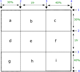
grid-line/grid-line
-
'1/2' means the grid-row-start and grid-column-start are 1 and 2 respectively. The other two values are set to auto.
grid-area: 1/2;
grid-line/grid-line/grid-line/grid-line
-
'2/3/2/3' means the grid-row-start, grid-column-start, grid-row-end, and grid-column-end are 2, 3, 2, and 3 respectively.
grid-area: 2/2/3/3;
named-area
-
'c' is the name area that we'll use to place an item.
grid-area: c;
CSS grid-column
CSS grid-column specifies the vertical grid lines to place an item in between. It is a shorthand property of grid-column-start and grid-column-end.
We have a grid that consists of 3 columns and 4 grid lines.
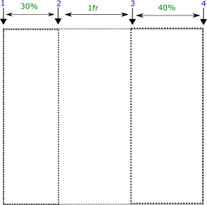
start/end
-
'1/2' means the item is placed between grid lines 1 and 2 i.e. within the first column.
grid-column: 1/2;
start/end
-
'2/3' means the item is placed between grid lines 2 and 3 i.e. within the second column.
grid-column: 2/3;
start/end
-
'3/4' means the item is placed between grid lines 3 and 4 i.e. within the third column.
grid-column: 3/4;
start/span columns
-
The first value represents the grid line and the second value after the span represents the number of columns occupied by the item.
grid-column: 1/span 2;
CSS grid-column-end
CSS grid-column-end represents vertical named or numbered grid line where the placement of an item ends.
We have a grid that consists of three (3) columns and four (4) grid lines. Suppose we have grid-column-start: 1; i.e. the placement of grid item starts from first grid line.
number
-
It represents the last grid line where the placement of an item ends.
'2' means the item is placed between grid line 1 to 2 i.e. within one column.
grid-column-end: 2;
number
-
'3' means the item is placed between grid line 1 to 3 i.e. within two columns.
grid-column-end: 3;
number
-
'4' means the item is placed between grid line 1 to 4 i.e. within three columns. Now, the item occupies the whole grid.
grid-column-end: 4;
CSS grid-column-start
CSS grid-column-start represents vertical named or numbered grid line where the placement of an item starts.
We have a grid that consists of three (3) columns and four (4) grid lines. Suppose we have grid-column-end: 4; i.e. the placement of grid item ends at grid line 4.
number
-
It represents the last grid line where the placement of an item ends.
'3' means the item is placed between grid line 3 to 4 i.e. within last one column.
grid-column-start: 3;
number
-
'2' means the item is placed between grid line 2 to 4 i.e. within last two columns.
grid-column-start: 2;
number
-
'1' means the item is placed between grid line 1 to 4 i.e. within last three columns. Now, the item occupies the whole grid.
grid-column-start: 1;
CSS grid-row
start/end
-
'1/2' means the item is placed between grid lines 1 and 2 i.e. within the first row.
grid-row: 1/2;
start/end
-
'2/3' means the item is placed between grid lines 2 and 3 i.e. within the second row.
grid-row: 2/3;
start/end
-
'3/4' means the item is placed between grid lines 3 and 4 i.e. within the third row.
grid-row: 3/4;
start/span columns
-
The first value represents the grid line and the second value after the span represents the number of rows occupied by the item.
grid-row: 1/span 2 ;
CSS grid-row-end
CSS grid-row-end represents horizontal named or numbered grid line where the placement of an item ends.
We have a grid that consists of three (3) rows and four (4) grid lines. Suppose we have grid-row-start: 1; i.e. the placement of grid item starts from first grid line.
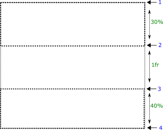
number
-
It represents the last grid line where the placement of an item ends.
'2' means the item is placed between grid line 1 to 2 i.e. within one row.
grid-row-end: 2;
number
-
'3' means the item is placed between grid line 1 to 3 i.e. within two rows.
grid-row-end: 3;
number
-
'4' means the item is placed between grid line 1 to 4 i.e. within three rows. Now, the item occupies the whole grid.
grid-row-end: 4;
CSS grid-row-start
number
-
It represents the last grid line where the placement of an item ends.
'3' means the item is placed between grid line 3 to 4 i.e. within last one column.
grid-row-start: 3;
number
-
'2' means the item is placed between grid line 2 to 4 i.e. within last two rows.
grid-row-start: 2;
number
-
'1' means the item is placed between grid line 1 to 4 i.e. within last three rows. Now, the item occupies the whole grid.
grid-row-start: 1;
CSS grid-template
It is a shorthand property of grid-template-areas, grid-template-column, and grid-template-rows.
We have a grid structure that contains 4 columns and 3 rows. we'll define different areas and place an item in one of those areas. The value consists of strings for the sake of understanding.
grid-template : none | [ grid-template-rows / grid-template-columns ] | [ line-name grid-area track-size ]+ / track-list
CSS grid-template-areas
CSS grid-template-areas represents named areas withing a grid. These grid areas may consist of more than one cells. These named grid areas are used to place the items.
We have a grid structure that contains 4 columns and 3 rows. we define different areas in the grid and place an item in one of those areas (a, b, c, d, e, f).
For example, we are placing an item in the 'b' area.
strings
-
We are observing an item that occupies the area 'b'. 'b' area consists of two cells in the first row.
grid-template-areas: "a a b b" "c c d d" "e e f f";
strings
-
'b' area is occupying the three cells in the second row.
grid-template-areas: "a a a a" "b b b c" "d d e f";
strings
-
'b' area is occupying four cells in the last row.
grid-template-areas: "a a a a" "c d e f" "b b b b";
CSS grid-template-columns
CSS grid-template-columns represents number of columns with their sizes. Columns are separated with a space.
In the following demo, we have a grid item (green box) that occupies the second column of the grid i.e. from grid line 2 to 3. We'll specify variable number of columns with different sizes in the grid.
col1 col2Default
-
The grid consists of two columns each with 50% width. The item occupies the second column (50%).
-
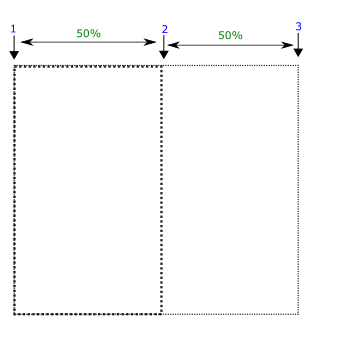
grid-template-columns: 50% 50%;
col1 col2 col3
-
The grid consists of three columns with 20px, 30%, and 1fr sizes. 1fr means remaining fractional size. The item occupies the second column (30%).
-
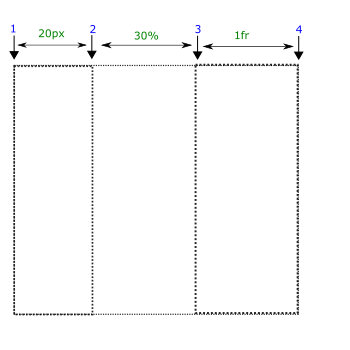
grid-template-columns: 20px 30% 1fr;
col1 col2 col3
-
The grid consists of three columns with 30px, 50px, and 1fr sizes. The item occupies the second column (50px).
-
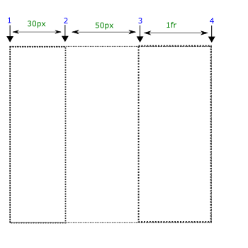
grid-template-columns: 30px 50px 1fr;
CSS grid-template-rows
CSS grid-template-rows represents number of rows with their sizes. Rows are separated with a space.
In the following demo, we have a grid item (green box) that occupies the second row of the grid i.e. from grid line 2 to 3. We'll specify variable number of rows with different sizes in the grid.
row1 row2Default
-
The grid consists of two rows each with 50% width. The item occupies the second row (50%).
-
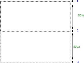
grid-template-rows: 50% 50%;
row1 row2 row3
-
The grid consists of three rows with 20px, 30%, and 1fr sizes. 1fr means remaining fractional size. The item occupies the second row (30%).
-
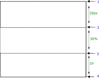
grid-template-rows: 20px 30% 1fr;
row1 row2 row3
-
The grid consists of three rows with 20px, 50px, and 1fr sizes. The item occupies the second row (50px).
-
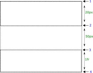
grid-template-rows: 20px 50px 1fr;
CSS height
CSS height property defines physical height of an element (box). The length units might be px, em, pt, in.
auto
-
auto value means the height will be changed automatically according to the content.
height: auto;
length
-
The height of an element should be at least 30px.
height: 300px;
percentage
-
The height of an element should be 30% of the parent box.
height: 30%;
min-content
-
min-content value represents that the height of an element must be equal to or greater than the largest minimum height of some descendant item i.e. it depends upon the minimum size of child element.
In this case, the min-height of descendant element is 100px.
height: min-content;
max-content
-
max-content value means the height of an element must be equal to or greater than the largest maximum height of some descendant item i.e. it depends upon the miximum size of child element.
In this case, the max-height of descendant element is 200px.
height: max-content;
CSS inline-size
CSS inline-size property defines width or height for an element. The selection of height or width depends upon the writing-mode.
The inline-size behaves as width for the horizontal-tb writing-mode.
The inline-size behaves as height for the vertical-* writing-mode.
autoDefault
-
auto value means the size will be changed automatically according to the content.
inline-size: auto;
+ve length
-
The inline-size of an element should be at least 300px.
inline-size: 300px;
+ve percentage
-
The size of an element should be 30% of the parent box.
inline-size: 30%;
CSS justify-content
CSS justify-content property aligns the content horizontally (along main/inline/row axis).
normalDefault
-
It stretches out the descendant elements to fill the height completely.
justify-content: normal;
baseline
-
It aligns multiple objects (elements) on same shared space such as cells within a row.
justify-content: baseline;
center
-
It aligns the content elements at the middle of cotainer.
justify-content: center;
stretch
-
It stretches all of the objects (elements) in such a way that they occupy the full height of the container.
justify-content: stretch;
flex-start
-
flex-start aligns the content at the start of flex container.
justify-content: flex-start;
flex-end
-
flex-start aligns the content at the start of flex container.
justify-content: flex-end;
space-between
-
flex-start aligns the content at the start of flex container.
justify-content: space-between;
space-around
-
The objects are distributed in such a way that there is same space between the objects except at the start and end of the container.
There is half sized space (half of the space that is between any two objects) before the first object and after the last object.
justify-content: space-around;
space-evenly
-
It adjusts the alignment of objects so as to distribute equal space between and around the objects.
CSS justify-items
CSS justify-items property aligns child items horizontally (main/inline/row axis) within its container by adjusting the margins. We are using a grid container as an example.
autoDefault
-
It stretches out the element vertically to fill the width of container completely.
justify-items: auto;
baseline
-
It aligns the element on the baseline.
justify-items: baseline;
center
-
It aligns the content at the middle of cotainer.
justify-items: center;
stretch
-
It stretches the element so as fill the width of container completely.
justify-items: stretch;
flex-start
-
flex-start aligns the current element at the start of flex container.
justify-items: flex-start;
flex-end
-
flex-end aligns the current element at the end of the flex container.
justify-items: flex-end;
justify-self
autoDefault
-
It stretches out the element vertically to fill the width of container completely.
justify-self: auto;
baseline
-
It aligns the element on the baseline.
justify-self: baseline;
center
-
It aligns the content at the middle of cotainer.
justify-self: center;
stretch
-
It stretches the element so as fill the width of container completely.
justify-self: stretch;
flex-start
-
flex-start aligns the current element at the start of flex container.
justify-self: flex-start;
flex-end
-
flex-end aligns the current element at the end of the flex container.
justify-self: flex-end;
CSS left
CSS left property represents the distance of left side of current box either from the left side of parent box or from the original position depending upon the value of position property.
The current element should have position property otherwise left property will not work. We apply position:absolute; property to the current element.
autoDefault
-
It does not replace the current box.
left: auto;
length
-
It represents the distance of the left side of the current box from the left side of the parent box.
The box is 100px away from the left side of the parent box (absolute position).
left: 100px;
percentage
-
Actually percentage represents height of the parent box.
The box is 20% away from the left side of the parent box (absolute position).
left: 20%;
CSS letter-spacing
CSS letter-spacing adds additional space between the letters.
normalDefault
-
In this case, no additional space is added i.e. it computes to 0 additional space.
letter-spacing: normal;
length
-
It adds 4px additional spacing between typographic units (letters, images, inline blocks) thus expanding the space.
letter-spacing: 4px;
line-height property
CSS line-height adds additional space between the lines of text.
normalDefault
-
In this case, no additional space is added i.e. it computes to 0 additional space.
line-height: normal;
length
-
It adds 40px vertical additional spacing between lines of text.
line-height: 40px;
percentage
-
percentage value represents the percentage of default line-height.
line-height: 140%;
CSS list-style
CSS list-style is a shorthand property of list-style-type, list-style-position, and list-style-image.
list-style : list-style-type list-style-position list-style-image
CSS list-style-image
CSS list-style-image adds an image as the content of list item markers.
noneDefault
-
no image is used as the content of list item markers. In this case, list-style-type defines the type of list item markers.
list-style-image: none;
url(image-address)
-
It defines the address of the image that is used as the content of list item markers.
list-style-image: url('img/web4college.png');
CSS list-style-position
outside Default
-
The table cell is visible even if there is no content within table cell.
list-style-position: outside;
inside
-
In this case, the markers become a part of the list item content.
list-style-position: inside;
CSS list-style-type
CSS list-style-type defines the type of list item markers.
discDefault
-
disc as item markers.
list-style-type: disc;
circle
-
circle as item markers.
list-style-type: circle;
decimal
-
decimal number as item markers
list-style-type: decimal;
decimal-leading-zero
-
decimal number as item markers with leading zero.
list-style-type: decimal-leading-zero;
lower-roman
-
lower roman numbers as item markers
list-style-type: lower-roman;
upper-roman
-
upper roman numbers as item markers.
list-style-type: upper-roman;
lower-greek
-
lower greek letters as item markers
list-style-type: lower-greek;
lower-latin
-
lower case latin letters as item markers
list-style-type: lower-latin;
upper-latin
-
upper case latin letters as item markers
list-style-type: upper-latin;
lower-alpha
-
lower alphabets as item markers.
list-style-type: lower-alpha;
upper-alpha
-
upper aphabets as item markers
list-style-type: upper-alpha;
armenian
-
armenian letters as item markers
list-style-type: armenian;
georgian
-
georgian letters as item markers
list-style-type: georgian;
CSS margin
It is a shorthand property that represents margin area around the border box. It is a shorthand property of margin-top, margin-right, margin-bottom, and margin-left properties.
margin : margin-top margin-right margin-bottom margin-left
CSS margin-block
It is a logical property that defines space at the start and end sides of a block. The selection of start side depends on the writing-mode.
It behaves like margin-top and margin-bottom for the horizontal-tb writing mode.
-
It behaves like margin-right and margin-left for the vertical-* writing-mode respectively.
margin-block : margin-block-start margin-block-end
CSS margin-block-end
It is a logical property that defines space at the end side of a block. The selection of start side depends on the writing-mode.
It behaves like margin-bottom for the horizontal-tb writing mode.
-
It behaves like margin-right or margin-left for the vertical-lr and vertical-rl writing-mode respectively.
CSS margin-block-start
It is a logical property that defines space at the start side of a block. The selection of start side depends on the writing-mode.
It behaves like margin-top for the horizontal-tb writing mode.
-
It behaves like margin-right or margin-left for the vertical-rl and vertical-lr writing-mode respectively.
CSS margin-bottom
It is a longhand property that represents margin area on the bottom side of the border box.
We are applying margin-bottom property to the red border box.
lengthDefault
-
There is no thickness of the margin area on the bottom side of the border box.
margin-bottom: 0;
+ve length
-
There is 20px space on the bottom side of the box.
margin-bottom: 20px;
-ve length
-
The space on the bottom side of the border decreases by 20px i.e. the content below this box may merge into this box.
margin-bottom: -20px;
CSS margin-inline
It is a logical property that defines space at the start and end sides of a inline. The selection of start side depends on the writing-mode.
It behaves like margin-top and margin-bottom for the horizontal-tb writing mode.
-
It behaves like margin-right and margin-left for the vertical-* writing-mode respectively.
margin-inline : margin-inline-start margin-inline-end
CSS margin-inline-end
It is a logical property that defines space at the end side of a inline. The selection of start side depends on the writing-mode.
It behaves like margin-bottom for the horizontal-tb writing mode.
-
It behaves like margin-right or margin-left for the vertical-lr and vertical-rl writing-mode respectively.
CSS margin-inline-start
It is a logical property that defines space at the start side of a inline. The selection of start side depends on the writing-mode.
It behaves like margin-left for the horizontal-tb writing mode.
-
It behaves like margin-bottom or margin-top for the vertical-rl and vertical-lr writing-mode respectively.
CSS margin-left
It is a longhand property that represents margin area on the left side of the border box.
0 length
-
There is no thickness of the margin area on the left side of the border box.
margin-left: 0;
+ve length
-
There is 20px space on the left side of the box.
margin-left: 20px;
-ve length
-
The space on the left side of the border decreases by 20px i.e. it may move on the left side.
margin-left: -20px;
CSS margin-right
It is a longhand property that represents margin area on the right side of the border box.
We are applying margin-right to the red border box.
0 length
-
There is no thickness of the margin area on the right side of the border box.
margin-right: 0;
+ve length
-
There is 20px space on the right side of the box.
margin-right: 20px;
-ve length
-
The space on the right side of the border decreases by 20px i.e. the content on the right side may merge into this box.
margin-right: -20px;
CSS margin-top
It is a longhand property that represents margin area above the top border of the box i.e. the influence range above the box.
lengthDefault
-
There is no thickness of the margin area on the top side of the border box.
margin-top: 0;
+ve length
-
There is 20px space on the top side of the box.
margin-top: 20px;
-ve length
-
The space on the top side of the border decreases by 20px i.e. it may move upwards.
margin-top: -20px;
CSS marker
CSS marker property draws a marker at all the vertices of markable elements. In short, it sets the values for marker-start, marker-end, ane marker-mid.
noneDefault
-
It does not add any marker at the vertices.
marker: none;
marker-reference
-
It draws a marker at all the vertices of markable element.
marker: url(#Triangle);
CSS marker-end
CSS marker-end property draws a marker at the last vertices of markable elements.
noneDefault
-
IIt does not add any marker at the last vertices of markable element.
marker-end: none;
marker-reference
-
It draws a marker at the last vertices of markable element.
marker-end: url(#Triangle);
CSS marker-mid
CSS marker-mid property draws a marker at the all the vertices (except the first and last vertices) of markable elements.
noneDefault
-
It does not add any marker at the vertices.
marker-mid: none;
marker-reference
-
It draws a marker at all the vertices of markable elements except the first and last vertices.
marker-mid: url(#Triangle);
CSS marker-start
CSS marker-start property draws a marker at the first vertices of markable elements.
noneDefault
-
It does not add any marker at the first vertices of markable element.
marker-start: none;
marker-reference
-
It draws a marker at the first vertices of markable element.
marker-start: url(#Triangle);
CSS mask
CSS mask is a shorthand property of mask-image, mask-position, mask-size, mask-repeat, mask-origin, mask-clip properties.
mask : mask-image mask-position mask-size mask-repeat mask-origin mask-clip
CSS mask-composite
CSS mask-composite property defines multiple composite operations to combine multi mask layers.
The first url layer is at the top i.e. close to the user. The last url is at the bottom of all the layers i.e. far away from the user.
In the demo, the circle is closer to the user than the square shape. Then the source layer is the circle while the square is the destination layer.
addDefault
-
The source layer is placed over the target layer.
mask-composite: add;
subtract
-
The destination mask layer will be subtracted from the source layer and then only the remaining source layer is visible.
mask-composite: subtract;
intersect
-
Only the intersected portion of both layers is visible.
mask-composite: intersect;
exclude
-
It is opposite to that of 'intersect' i.e. the portions of both layers that don't intersect are visible.
mask-composite: exclude;
clear
-
It does not enable any layer.
mask-composite: clear;
copy
-
Only the source layer is visible.
mask-composite: copy;
source-over
-
It places the source layer over the destination layer.
mask-composite: source-over;
destination-over
-
It places the destination layer over the source layer.
mask-composite: destination-over;
source-in
-
represents only the source area that overlaps the destination layer.
mask-composite: source-in;
destination-in
-
represents only the destination area that overlaps the source layer.
mask-composite: destination-in;
source-out
-
It represents the portion of source layer that falls outside the overlapping area.
mask-composite: source-out;
destination-out
-
It represents the portion of destination layer that falls outside the overlapping area.
mask-composite: destination-out;
source-atop
-
It represents both the overlapping area and destination area.
mask-composite: source-atop;
destination-atop
-
It represents both the overlapping area and source area.
mask-composite: destination-atop;
xor
-
The non-overlapping regions of both the source and destination layers.
mask-composite: xor;
CSS mask-clip
CSS mask-clip property specifies the area affected by the mask.
border-boxDefault
-
There is no thickness of the margin area on the top side of the border box.
mask-clip: border-box;
padding-box
-
In this case, the mask of the areas that are within padding-box are painted such as the padding and content areas.
mask-clip: padding-box;
content-box
-
Only mask of content-area is painted i.e. excluding the other two areas.
mask-clip: content-box;
CSS mask-image
CSS mask-image property adds an image as the mask of an element.
We will apply mask to a green box in the demo.
noneDefault
-
It does not add any mask to an element.
mask-image: none;
border-boxDefault
-
It adds an image as the mask.
mask-image: url(img/web4college.png);
CSS mask-origin
CSS mask-origin property specifies the position of mask image with respect to different components of box model i.e. we define a point where we start measuring for the mask position.
padding-boxDefault
-
The mask image is positioned relative to the padding box.
mask-origin: padding-box;
border-box
-
The mask image is positioned relative to the border box.
mask-origin: border-box;
content-box
-
The mask image is positioned relative to the content box.
mask-origin: content-box;
CSS mask-position
The mask images can be positioned within mask positioning area by using the keywords or percentage values given below.
There are always two values of mask-position (horizontal and vertical offset). If only one value is specified the other one is assumed to be 50% or center.
X-offset Y-offsetDefault
-
Horizontal offset is 0% which means 0% width of the mask image is under 0% width of the mask positioning area from the left side.
Vertical offset is 0% which means that 0% height of the mask image is under 70% height of the mask positioning area from the top side.
mask-position: 0% 0%;
X-offset Y-offset
-
Horizontal offset is 40% which means 40% width of the mask image is under 40% width of the mask positioning area from the left side.
Vertical offset is 70% which means that 70% height of the mask image is under 70% height of the mask positioning area from the top side.
mask-position: 40% 70%;
XY-offset
-
This one value represents both vertical and horizontal offsets.
For examples, 30% value means 30% is horizontal offset and 50% is vertical offset (default). It computes to 30% 50%.
mask-position: 30%;
left
-
The mask image is aligned on the left side horizontally (first value is 0%). And it is aligned at the center vertically (default). It computes to 0% 50%.
mask-position: left;
center
-
This value aligns the mask image horizontally and vertically at the center. It computes to 50% 50%.
mask-position: center;
right
-
This value aligns the mask image horizontally on the right side (first value is 100%). It computes to 100% 50%
mask-position: right;
top
-
top value vertically aligns the mask image at the top (second value is 0%). It computes to 50% 0%.
mask-position: top;
bottom
-
bottom value aligns an image vertically at the bottom (second value is 100%). It computes to 50% 100%.
mask-position: bottom;
CSS mask-repeat
CSS mask-repeat specifies how the mask images are placed after they have been sized and positioned.
repeatDefault
-
The mask mask image is repeated along both axes to fill the painting area completely. It is the same as repeat repeat.
mask-repeat: repeat;
no-repeat
-
The mask image should not be repeated to fill the painting area.
mask-repeat: no-repeat;
repeat-x
-
The mask image is repeated along x-axis only. It is the same as repeat no-repeat
mask-repeat: repeat-x;
repeat-y
-
The mask image is repeated along y-axis only. It is the same as no-repeat repeat
mask-repeat: repeat-y;
space
-
In this case, the mask images are repeated and spaced out (kept at a distance) so as to fill the painting area completely. The first and last mask images must touch the corners of the painting area.
mask-repeat: space;
round
-
The image is repeated untill it fills the background painting area. If it does not fit the painting area a whole number of times, the mask image is rescaled so as to fit the area.
mask-repeat: round;
CSS mask-size
CSS mask-size property defines the size of mask image on the mask painting area.
autoDefault
-
The size of mask image is automatically calculated.
mask-size: auto;
contain
-
The image is rescaled to the largest size such that both sides of the image fit inside the mask painting area while preserving the aspect ratio.
mask-size: contain;
cover
-
The image is rescaled to the smallest size such that it covers the mask painting area completely while preserving the aspect ratio.
mask-size: cover;
length
-
We specify fixed length for the mask image size.
mask-size: 20px;
length
-
It represents the image size as the percentage of mask painting area.
30% means the mask image occupies the 30% of element. And three images can fill the painting area of element with this size.
mask-size: 30%;
CSS max-block-size
CSS max-block-size specifies the maximum block-size of an element.
When the content overflows the block-size, it adds a vertical scroll bar to the element.
It behaves like max-width for the horizontal-tb writing mode.
-
It behaves like max-height for the vertical-* writing-mode.
CSS max-height
CSS max-height specifies the maximum height of an element.
When the content overflows the height, it adds a vertical scroll bar to the element.
noneDefault
-
No limit of height is applied to an element.
max-height: none;
min-content
-
min-content value specifies the largest minimum height of some descendant item.
The height of the current element will be equal to the descendant element that has smallest height.
max-height: min-content;
max-content
-
max-content value represents that the largest maximum height of some descendant item.
The height of the current element will be equal to the descendant element that has largest height.
max-height: max-content;
length
-
length value specifies the maximum height of the element.
30px value means the height of an element can't exceed 30px no matter how much content is inside this element.
max-height: 30px;
auto
-
auto value means the height will be changed automatically according to the content.
max-height: auto;
CSS max-inline-size
CSS max-inline-size specifies the maximum inline-size of an element.
When the content overflows the inline-size, it adds a vertical scroll bar to the element.
It behaves like max-height for the horizontal-tb writing mode.
-
It behaves like max-width for the vertical-* writing-mode.
CSS max-width
noneDefault
-
No limit of width is applied to an element.
max-width: none;
min-content
-
min-content value specifies the largest minimum width of some descendant item.
max-width: min-content;
max-content
-
min-content value specifies the largest minimum width of some descendant item.
max-width: max-content;
+ve length
-
30px value specifies the maximum width of the element.
max-width: 30px;
+ve percentage
-
30% means the width of current box can not exceed 30% of the parent box.
max-width: 30%;
auto
-
auto value means the width will be changed automatically according to the content.
max-width: auto;
CSS min-block-size
CSS min-block-size specifies the minimum block-size of an element.
It behaves like min-width for the horizontal-tb writing mode.
-
It behaves like min-height for the vertical-* writing-mode.
CSS min-height
CSS max-height specifies the maximum height of an element.
When the content overflows the height, it adds a vertical scroll bar to the element.
noneDefault
-
No limit of height is applied to an element.
min-height: none;
min-content
-
min-content value specifies that the minimum height of element must be equal to or greater than the largest minimum height of some descendant item.
min-height: min-content;
max-content
-
max-content value represents that the minimum height of element must be equal to or greater than the largest maximum height of some descendant item.
min-height: max-content;
+ve length
-
The height of element should be at least 300px.
min-height: 300px;
+ve percentage
-
The height of element should be at least 30% of the parent box.
min-height: 30%;
auto
-
auto value means the height will be changed automatically according to the content.
min-height: auto;
CSS min-inline-size
CSS min-inline-size specifies the minimum inline-size of an element.
It behaves like min-height for the horizontal-tb writing mode.
-
It behaves like min-width for the vertical-* writing-mode.
CSS min-width
noneDefault
-
No limit of width is applied to an element.
min-width: none;
min-content
-
min-content value specifies that the minimum width of element must be equal to or greater than the largest minimum width of some descendant item.
min-width: min-content;
max-content
-
max-content value represents that the minimum width of element must be equal to or greater than the largest maximum width of some descendant item.
min-width: max-content;
+ve length
-
The width of element should be at least 300px.
min-width: 300px;
auto
-
auto value means the width will be changed automatically according to the content.
min-width: auto;
CSS mix-blend-mode
This property blends source color with the backdrop (image or some element) colors.
Source color represents the background-color of some element.normalDefault
-
No blending is applied.
mix-blend-mode: normal;
multiply
-
It multiplies the backdrop (image) with the source (background-color) and replaces those changes in the backdrop.
mix-blend-mode: multiply;
screen
-
It multiplies the backdrop (image) with the source color and then complements.
mix-blend-mode: screen;
screen
-
It multiplies or screens the colors depending on the backdrop (image) color.
mix-blend-mode: overlay;
darken
-
It selects the darker color of the backdrop (image).
mix-blend-mode: darken;
lighten
-
It selects the lighten color of the backdrop (image).
mix-blend-mode: lighten;
color-dodge
-
It brightens the backdrop (image) to reflect the source color.
mix-blend-mode: color-dodge;
color-burn
-
It darkens the backdrop (image) to reflect the source color.
mix-blend-mode: color-burn;
hard-light
-
It multiplies or screens the colors depending on the source color.
mix-blend-mode: hard-light;
soft-light
-
It darkens or lightens the colors depending on the source color.
mix-blend-mode: soft-light;
difference
-
It subtracts darker color from the lighter color.
mix-blend-mode: difference;
exclusion
-
It produces the same effect but lower in contrast.
mix-blend-mode: exclusion;
hue
-
It creates a color with the hue of source color and the saturation and luminosity of the backdrop (image).
mix-blend-mode: hue;
saturation
-
It creates a color with the saturation of source color and the hue and luminosity of the backdrop (image).
mix-blend-mode: saturation;
color
-
It creates a color with the hue and the saturation of the source color and luminosity of the backdrop (image).
mix-blend-mode: color;
luminosity
-
It creates a color with the luminosity of the source color and the hue and saturation of the backdrop (image).
mix-blend-mode: luminosity;
CSS opacity
CSS opacity property determines the transparency of an element. The value of opacity varies from 0 to 1 i.e. [0-1]
fully opaqueDefault
-
The object (element) is fully opaque.
opacity: 1;
fully transparent
-
The object (element) is fully transparent.
opacity: 0;
partially transparency
-
It represents 50% transparency of the object (element).
opacity: 0.5;
CSS order
CSS order determines the order of a flex item. The order means a flex item placed anywhere in the list of flex items can be positioned at the start or end of of this list.
We have four flex items in the flex container. We'll position the third flex item with order property.
integerDefault
-
An integeral value determines the order of flex item in a flex container. 0 value does not change the position of flex item.
order: 0;
integer
-
-1 value positions the third flex item at the start of container.
This value positions the third item (3) at the start of flex container.
order: -1;
+ve integer
-
1 value positions the third flex item at the end of flex container. This value positions the third item at the end of flex container
This value positions the third item (3) at the end of flex container.
order: 1;
CSS outline
CSS outline property defines the width, style, and color of the ouline of a box. It is a shorthand property of outline-width, outline-style, and outline-color.
outline : outline-width outline-style outline-color
CSS outline-offset
CSS outline-offset represents space between border and outline. If you want to make sure a focus line outside the element at a distance, you must use outline-offset.
length
-
length value represents space between border or element (if there is no border) and outline.
outline-offset: 5px;
CSS outline-color
CSS outline-color property defines the color for the outline of a box.
currentColorDefault
-
currentColor keyword represents the same color for the top side border as of text color.
outline-color: currentColor;
color-name
-
The following demo represents skyblue color for the top side border.
outline-color: skyblue;
rgb value
-
It represents rgb value of a color.
The hexadecimal value of red color for the top side border is given below.
outline-color: rgb(255,0,0);
hexadecimal value
-
It represents hexadecimal notation of red color.
The hexadecimal notation of blue color for the top side border is given below.
outline-color: #0000ff;
CSS outline-style
CSS outline-style defines style for the outline of a box.
noneDefault
-
There is no style. In this case, the color and width of outline are also ignored i.e. 0px outline.
outline-style: none;
dashed
-
The outline consists of a series of square shaped dashes.
outline-style: dashed;
dotted
-
The outline consists of a series of round dots.
outline-style: dotted;
solid
-
The outline consists of a solid line.
outline-style: solid;
double
-
The outline consists of two lines. The total ouline-width equals to the two lines and space between them.
outline-style: double;
ridge
-
The content seems to be coming out of the canvas. It is obtained by producing the box-shadow from the two colors that are lighter and darker than the outline-color.
The outer side of the outline is darker than the inner side of the outline.
outline-style: ridge;
groove
-
The content seems to be going into the canvas. It is obtained by producing the box-shadow from the two colors that are lighter and darker than the border-color.
The inner side of the outline is darker than the outer side of the outline.
outline-style: groove;
CSS outline-width
mediumDefault
-
medium value represents medium sized outline. thin≤medium≤thick
outline-side: medium;
thin
-
thin value defines thin outline .
outline-width: thin;
thick
-
thick value defines a thick outline.
outline-side: thick;
thick
-
length defines the width of outline. The used units might be px, in, em, pt.
outline-width: 10px;
CSS overflow
CSS overflow property represents the behavior of content when it overflows out of the box along both horizontal and vertical directions.
It is a shorthand property of overflow-x and overflow-y.
If only one value is specified, the other one is copied from the first one.
visibleDefault
-
The content overflows out of the boundaries of the box and is also visibile.
It is the same as overflow: visibile visibile;
overflow: visible;
hidden
-
In this case, the content that overflows out of the box becomes invisible.
It is the same as overflow: hidden hidden;.
overflow: hidden;
scroll
-
It provides scrollbar no matter whether the content overflows or not.
It is the same as overflow: scroll scroll;.
overflow: scroll;
auto
-
It is same as 'scroll' but its scrollbar is visibile only when the content overflows out of the box.
Both values are 'auto' i.e. overflow: auto auto;
overflow: auto;
CSS overflow-wrap
normalDefault
-
In this case, the lines only break at allowed break points i.e. between the words and not between the letters.
In this case, the words are unbreakable on wrapping.
overflow-wrap: normal;
break-word
-
It applies to an element only when there are no acceptable break points available i.e. between the words.
`It breaks the words at arbitrary points.
overflow-wrap: break-word;
CSS overflow-x
CSS overflow-x property represents overflow of content along horizontal direction i.e. from left and right sides.
visibleDefault
-
The content overflows horizontally out of the boundaries of the box and is also visibile.
overflow-x: visible;
hidden
-
In this case, the content that overflows horizontally out of the box becomes invisible.
overflow-x: hidden;
scroll
-
It provides horizontal scrollbar no matter whether the content overflows or not.
overflow-x: scroll;
auto
-
It is same as 'scroll' but it provides horizontal scrollbar only when the content overflows out of the box.
overflow-x: auto;
CSS overflow-y
CSS overflow-y property represents overflow of content along vertical direction i.e. from top and bottom sides.
visibleDefault
-
The content overflows vertically out of the boundaries of the box and is also visibile.
overflow-y: visible;
hidden
-
In this case, the content that overflows vertically out of the box becomes invisible.
overflow-y: hidden;
scroll
-
It provides vertical scrollbar no matter whether the content overflows or not.
overflow-y: scroll;
auto
-
It is same as 'scroll' but it provides vertical scrollbar only when the content overflows out of the box.
overflow-y: auto;
CSS padding
CSS padding property represents space between the sides of content and the border areas. It increases the size of a box more than usual.
It is a shorthand property of padding-top, padding-right, padding-bottom, and padding-left.
Negative values are not allowed.
padding :padding-top padding-right padding-bottom padding-left
CSS padding-block
It is a logical property that defines space at the start and end sides of the content inside a box. The selection of start side depends on the writing-mode.
It behaves like padding-top and padding-bottom for the horizontal-tb writing mode.
-
It behaves like padding-right and padding-left for the vertical-* writing-mode respectively.
padding-block : padding-block-start padding-block-end
CSS padding-block-end
It is a logical property that defines space at the end of content inside a block. The selection of start side depends on the writing-mode.
It behaves like padding-bottom for the horizontal-tb writing mode.
-
It behaves like padding-right or padding-left for the vertical-lr and vertical-rl writing-mode respectively.
CSS padding-block-start
It is a logical property that defines space at the start of content area inside a box. The selection of start side depends on the writing-mode.
It behaves like padding-top for the horizontal-tb writing mode.
-
It behaves like padding-right or padding-left for the vertical-rl and vertical-lr writing-mode respectively.
CSS padding-bottom
CSS padding-bottom property represents space between the bottom sides of content and the border areas. It increases the height of a box more than usual.
Negative values are not allowed.
length Default
-
There is no space between the bottom side border and content area.
padding-bottom: 0;
+ve length
-
There is 30px space between bottom side border and content area. The height of box increases by 30px due to padding-bottom.
padding-bottom: 30px;
CSS padding-inline
It is a logical property that defines space at the start and end sides of a inline. The selection of start side depends on the writing-mode.
It behaves like padding-top and padding-top for the horizontal-tb writing mode.
-
It behaves like padding-right and padding-left for the vertical-* writing-mode respectively.
padding-inline : padding-inline-start padding-inline-end
CSS padding-inline-end
It is a logical property that defines space at the end side of a inline. The selection of start side depends on the writing-mode.
It behaves like padding-bottom for the horizontal-tb writing mode.
-
It behaves like padding-right or padding-left for the vertical-lr and vertical-rl writing-mode respectively.
CSS padding-inline-start
It is a logical property that defines space at the start side of a inline. The selection of start side depends on the writing-mode.
It behaves like padding-left for the horizontal-tb writing mode.
-
It behaves like padding-bottom or padding-top for the vertical-rl and vertical-lr writing-mode respectively.
CSS padding-left
CSS padding-left property represents space between the left sides of content and the border areas. It increases the height of a box more than usual.
Negative values are not allowed.
length Default
-
There is no space between the bottom side border and content area.
padding-left: 0;
+ve length
-
There is 40px space between bottom side border and content area. The width of box increases by 40px due to padding-bottom.
padding-left: 40px;
CSS padding-right
CSS padding-right property represents space between the right sides of content and the border areas. It increases the height of a box more than usual.
Negative values are not allowed.
length Default
-
There is no space between the right side border and content area.
padding-right: 0;
+ve length
-
There is 30px space between right side border and content area. The width of box increases by 30px due to padding-right.
padding-right: 30px;
CSS padding-top
CSS padding-top property represents space between the top sides of content and the border areas. It increases the height of a box more than usual.
Negative values are not allowed.
length Default
-
There is no space between the top side border and content area.
padding-top: 0;
+ve length
-
There is 30px space between top side border and content area. The height of box increases by 30px due to padding-top.
padding-top: 30px;
CSS perspective
CSS perspective property esatablishes a new stacking context and allows the 3-D transformation of children elements. Remember that it applies to the transform children elements and not the element itself.
In the demo, we apply 'perspective' property to the element. But its effect is visible on the children elements.
noneDefault
-
In this case, no perspective is applied.
perspective: none;
length
-
It translates the box by 50px along Y-axis.
perspective: 300px;
CSS perspective-origin
CSS perspective-origin property represents the origin of perspective property. This point is located with respect to top and left edges of the element where a user seems to be looking at the transformation of children elements.
There are two possible values (X and Y). If only one value is specified, the second one is assumed to be the 'center'.
percentage percentageDefault
-
The perspective origin is at 50% from top side and 50% from left side. It is the same as perspective-origin: center center;.
perspective-origin: 50% 50%;
percentage percentage
-
The perspective origin is at 30% from top side and 40% from left side.
perspective-origin: 30% 40%;
length length
-
The perspective origin is at 30px from top side and 40px from left side.
perspective-origin: 30px 40px;
right bottom
-
The perspective-origin is the bottom right corner. It is the same as perspective-origin: 100% 100%;.
perspective-origin: right bottom;
left top
-
The perspective-origin is the top left corner. It is the same as perspective-origin: 0% 0%;.
perspective-origin: left top;
center top
-
The perspective-origin is the top center. It is the same as perspective-origin: 50% 0%;.
perspective-origin: center top;
top
-
Since the second value is not present, it is assumed to be 'center'. It is the same as perspective-origin: center top;.
perspective-origin: top;
CSS place-content
CSS place-content property aligns the content horizontally and vertically. It is a shorthand property of both align-content and justify-content.
place-content : align-content justify-content
CSS place-items
CSS place-items property controls the alignment of the child items vertically and horizontally. It is a shorthand property of align-items and justify-items.
We are using a grid container as an example.
place-items : align-items justify-items
CSS place-self
CSS place-self property places an element horizontally and vertically. It is a shorthand property of align-self and justify-self.
place-self : align-self justify-self
CSS position
CSS position property specifies the position of an element i.e. the position of an element should be either relative to its original position or with respect to parent box.
The parent must be positioned. And we are applying top:30px; and right:30px; to reposition the current element.
staticDefault
-
In this case, the element does not change the position.
position: static;
relative
-
It replaces the element with respect to its original position.
position: relative;
absolute
-
It replaces the element with respect to its parent box.
position: absolute;
sticky
-
sticky value positions in the same way as relative but its position may change when any of its side matches the parent side.
position: sticky;
fixed
-
It fixes the element with respect to viewport.
position: fixed;
CSS resize
CSS resize property specifies whether an element is resizable or not. And if it is resizable then along which axis.
resize property applies to all the elements having overflow property with auto value.
noneDefault
-
The element is not resizable.
resize: none;
both
-
The element is resizable along both x and y axes.
resize: both;
horizontal
-
The element is resizable only along x-axis. In this case, the width of an element is resizable.
resize: horizontal;
vertical
-
The element is resizable only along y-axis. In this case, the height of an element is resizeable.
resize: vertical;
CSS right
CSS right property represents the distance of right side of current box either from the right side of parent box or from the original position depending upon the value of position property.
The current element should have position property otherwise right property will not work. We apply position:absolute; property to the current element.
autoDefault
-
It does not replace the current box.
right: auto;
length
-
It represents the distance of the right side of the current box from the right side of the parent box.
The box is 100px away from the right side of the parent box (absolute position).
right: 100px;
percentage
-
Actually percentage represents height of the parent box.
The box is 20% away from the right side of the parent box (absolute position).
right: 20%;
CSS row-gap
CSS row-gap property represents the gap between two adjacent rows. We take an example of a grid that contains three grid items.
normalDefault
-
It represents 0px gap between rows.
row-gap: normal;
length
-
length value adds respective gap between the rows. The following demo represents 30px gap between the rows.
row-gap: 30px;
CSS scroll-behavior
CSS scroll-behavior represents the scrolling behavior within a scrolling box due to navigation. The scrolling that a user performs is not affected by this property but rather with the navigational links.
autoDefault
-
It does not represent smooth behavior.
scroll-behavior: auto;
smooth
-
It smoothens the scrolling.
scroll-behavior: auto;
CSS scroll-margin
CSS scroll-margin property specifies top,right,bottom, and left edges of the scroll snap area.
scroll snap area = the rectangular area (bounded by yellow border) of the item bounded by the scroll container (bounded by red border) + specified offset
It is a shorthand property of scroll-margin-top, scroll-margin-right, scroll-margin-bottom, and scroll-margin-left properties.
scroll-margin :scroll-margin-top scroll-margin-right scoll-margin-bottom scroll-margin-left
CSS scroll-margin-bottom
CSS scroll-margin-bottom property specifies bottom edge of the scroll snap area.
scroll snap area = the rectangular area (bounded by yellow border) of the item bounded by the scroll container (bounded by red border) + specified offset.
Please move the scrollbar to see the effect of margin.
+ve length Default
-
There is no offset on the bottom side of the scroll snap area.
scroll-margin-bottom: 0;
+ve length
-
It specifies the bottom edge offset of the scroll item.
In the demo, there is 100px offset on the bottom edge of the scroll snap area.
scroll-margin-bottom: 100px;
CSS scroll-margin-left
CSS scroll-margin-left property specifies left edge of the scroll snap area.
scroll snap area = the rectangular area (bounded by yellow border) of the item bounded by the scroll container (bounded by red border) + specified offset
Please move the scrollbar to see the effect of margin.
+ve length Default
-
There is no offset on the top edge of the scroll snap area.
scroll-margin-left: 0;
+ve length
-
It specifies the left edge offset of the scroll item.
In the demo, there is 100px offset on the left edge of the scroll snap area.
scroll-margin-left: 100px;
CSS scroll-margin-right
CSS scroll-margin-right property specifies right edge of the scroll snap area.
scroll snap area = the rectangular area (bounded by yellow border) of the item bounded by the scroll container (bounded by red border) + specified offset.
Please move the scrollbar to see the effect of margin.
+ve length Default
-
There is no offset on the top edge of the scroll snap area.
scroll-margin-right: 0;
+ve length
-
It specifies the right edge offset of the scroll item.
In the demo, there is 100px offset on the right edge of the scroll snap area.
scroll-margin-right: 100px;
CSS scroll-margin-top
CSS scroll-margin-top property specifies top edge of the scroll snap area.
scroll snap area = the rectangular area (bounded by yellow border) of the item bounded by the scroll container (bounded by red border) + specified offset.
Please move the scrollbar to see the effect of margin.
+ve length Default
-
There is no offset on the top edge of the scroll snap area.
scroll-margin-top: 0;
+ve length
-
It specifies the top edge offset of the scroll item.
In the demo, there is 100px offset on the top edge of the scroll snap area.
scroll-margin-top: 100px;
CSS scroll-padding
CSS scroll-padding-bottom property specifies the top, right, bottom, and left edges of the snapport.
* Snapport is the area in the view of user where scrolling of items is possible. Red rectangular box represents snapport.
Please move the scrollbar to see the effect of padding.
scroll-padding :scroll-padding-top scroll-padding-right scroll-padding-bottom scroll-padding-left
CSS scroll-padding-bottom
CSS scroll-padding-bottom property specifies the bottom edge of the snapport.
* Snapport is the area in the view of user where scrolling of items is possible. The box bounded by red box represents snapport.
Please move the scrollbar to see the effect of padding.
+ve length Default
-
There is no offset on the bottom edge of the snapport.
scroll-padding-bottom: 0;
+ve length Default
-
It specifies the bottom edge offset of the scroll item.
In the demo, there is 100px offset on the bottom edge of the snapport.
scroll-padding-bottom: 100px;
CSS scroll-padding-left
CSS scroll-padding-left property specifies the left edge of the snapport.
* Snapport is the area in the view of user where scrolling of items is possible. Red rectangular box represents snapport.
Please move the scrollbar to see the effect of padding.
+ve length Default
-
There is no offset on the left edge of the snapport.
scroll-padding-left: 0;
+ve length
-
It specifies the offset on the left edge of the snapport.
In the demo, there is 100px offset on the left edge of the snapport.
scroll-padding-left: 100px;
CSS scroll-padding-right
CSS scroll-padding-right property specifies the right edge of the snapport.
* Snapport is the area in the view of user where scrolling of items is possible. Red rectangular box represents snapport.
Please move the scrollbar to see the effect of padding.
+ve length Default
-
There is no offset on the right edge of the snapport.
scroll-padding-right: 0;
+ve length
-
It specifies the offset on the right edge of the snapport.
In the demo, there is 100px offset on the right edge of the snapport.
scroll-padding-right: 100px;
CSS scroll-padding-top
CSS scroll-padding-top property represents offset on the top edge of the snapport.
* Snapport is the area in the view of user where scrolling of items is possible. Red rectangular box represents snapport.
Please move the scrollbar to see the effect of padding.
+ve lengthDefault
-
There is no offset on the top edge of the snapport.
scroll-padding-top: 0;
+ve lengthDefault
-
It specifies the offset on the top edge of the snapport.
In the demo, there is 100px offset on the top edge of the snapport.
scroll-padding-top: 100px;
CSS scroll-padding
CSS scroll-padding property specifies the top, right, bottom, and left edges of the snapport.
* Snapport is the area in the view of user where scrolling of items is possible. Red rectangular box represents snapport.
Please move the scrollbar to see the effect of padding.
scroll-padding :scroll-padding-top scroll-padding-right scroll-padding-bottom scroll-padding-left
CSS scroll-snap-align
CSS scroll-snap-align represents the snap position of a box's snap area within container's snapport.
The snap area is the yellow rectangular box while red box represents container's snapport.
noneDefault
-
It does not specify any snap position.
scroll-snap-align: none;
start
-
The end side of the snap area (child element) touches the end side of container's snapport.
scroll-snap-align: start;
end
-
It does not specify any snap position.
scroll-snap-align: end;
center
-
The snap area (child element) is centered within container's snapport.
scroll-snap-align: center;
CSS scroll-snap-stop
CSS scroll-snap-stop allows a possible snap position to trap the scrolling operation. It forces the scroll container to stop the scrolling operaton before it naturally ends.
Remember that this property has no effect on scrolling operations with only intended end position.
normalDefault
-
The scroll container may pass over snap positions during the execution of a scrolling mechanism.
scroll-snap-stop: normal;
always
-
The scroll container should not pass over snap positions during the execution of a scrolling mechanism.
scroll-snap-align: always;
CSS shape-outside
CSS shape-outside defines the shape of float-area to wrap the inline content. The inline content can be wrapped from the left (floating on the left side) and right (floating on the right side) sides only.
We have an image floating on the left side. We can define the shape of float-area on the left side this image. We can apply the shape-outside property only to the floating element.
polygon
-
There is no offset on the top edge of the snapport.
shape-outside: polygon(0 0, 100% 100%, 0 100%);
CSS shape-margin
CSS shape-margin defines the margin area outside the shape defined by shape-outside. For example, we have a shape outside the floated element. We can define the margin area outside this float-area.
lengthDefault
-
length defines the margin outside the float-area defined by the shape-outside.
shape-margin: 0;
length
-
There is 10px margin area outside the float-area defined by the shape-outside.
shape-margin: 10px;
CSS stroke
CSS stroke is a shorthand property of stroke-color, stroke-image, stroke-origin, stroke-position, stroke-size, and stroke-repeat properties.
Remember that all browsers do not support it completely. It only specifies the color of the stroke in the browsers.
currentColorDefault
-
currentColor keyword represents the same color for stroke as of text color.
stroke: currentColor;
color-name
-
The following demo represents skyblue color for the stroke of an element.
stroke: skyblue;
rgb value
-
It represents rgb value of a color. The hexadecimal value of red color is given below.
stroke: rgb(255,0,0);
hexadecimal value
-
It represents hexadecimal notation of red color. The hexadecimal notation of blue color is given below.
stroke: #0000ff;
CSS stroke-color
CSS stroke-color defines the color of stroke as of border.
Remember that no browser supports stroke-color. Therefore, we use stroke, a shorthand property, to define the color of stroke.
currentColorDefault
-
currentColor keyword represents the same color for stroke as of text color.
stroke-color: currentColor;
color-name
-
The following demo represents skyblue color for the stroke of an element.
stroke-color: skyblue;
rgb value
-
It represents rgb value of a color. The hexadecimal value of red color is given below.
stroke-color: rgb(255,0,0);
hexadecimal value
-
It represents hexadecimal notation of red color. The hexadecimal notation of blue color is given below.
stroke-color: #0000ff;
CSS stroke-dasharray
CSS stroke-dasharray defines a pattern of dashes for stroke path.
noneDefault
-
It represents a continuous pattern of dashes for a stroke path.
stroke-dasharray: none;
length
-
The stroke pattern consists of alternate dashes separated by equal sized spaces. 20px means the pattern consists of dashes each having 20px size. They are separated by the same size as of dashe size i.e. 20px.
stroke-dasharray: 20px;
percentage
-
It represents the size of dashes in percentage. The dashes repeat themselves along the stroke path in an alternate manner.
stroke-dasharray: 5%;
CSS stroke-dashoffset
CSS stroke-dashoffset property adds an offset distance at the start of dash array.
lengthDefault
-
length value adds respective distance at the start of dash array.
The following demo adds 0px offset distance at the start of dash array.
stroke-dashoffset: 0px;
length
-
20px value moves the dash array by 20px at the beginning of dash pattern.
stroke-dashoffset: 20px;
CSS stroke-linecap
CSS stroke-linecap property defines the shape of corners at the end of a line.
buttDefault
-
It represents squared shaped corners of an SVG line.
stroke-linejoin: butt;
round
-
It adds additional round corners at the both ends of an svg line.
stroke-linejoin: round;
square
-
It adds additional square corners at the both ends of an svg line.
stroke-linecap: square;
CSS stroke-linejoin
CSS stroke-linejoin property specifies the shapes at the corners of paths or shapes.
miterDefault
-
It represents the sharp corners where path segments meet. It is formed by extending the strokes of the edges until they intersect.
stroke-linejoin: crop;
bevel
-
It crops the corners at the intersect point by the perpendicular to its diagonal.
stroke-linejoin: bevel;
round
-
It converts the sharp corners into round shape corners.
stroke-linejoin: arcs;
CSS stroke-opacity
CSS stroke-opacity property determines the transparency of stroke object. The value of stroke-opacity varies from 0 to 1 i.e. [0-1]
fully opaqueDefault
-
The stroke object (element) is fully opaque.
stroke-opacity: 1;
fully transparent
-
The stroke object is fully transparent.
stroke-opacity: 0;
partially transparency
-
It represents 50% transparency of the stroke object.
stroke-opacity: 0.5;
CSS stroke-width
CSS stroke-width property represents the width of the stroke.
+ve lengthDefault
-
It specifies the default width of stroke in some unit.
stroke-width: 1px;
+ve length
-
It specifies the width of stroke in some unit.
stroke-width: 50px;
percentage
-
It is same as 'scroll' but it provides vertical scrollbar only when the content overflows out of the box.
stroke-width: 20%;
CSS tab-size
CSS tab-size represents size of a tab charcter in px or in a number.
numberDefault
-
The number represents a multiple of the space character's advanced width.
tab-size: 8;
length
-
It directly determines the size of a tab character. 40px means the width of tab character is 40px.
tab-size: 40px;
CSS table-layout
CSS table-layout represents whether the the width of table columns should be fixed or automatically calculated.
autoDefault
-
In this auto mode, the width of table columns depends upon the content within table cells.
table-layout: auto;
fixed
-
In this fixed mode, the width of table columns does not depend upon the the content of table cells.
The width of columns is calculated from the size of cells present in the first table row. In this case, equal share of space is distributed among the table cells.
table-layout: fixed;
CSS text-align
CSS text-align property represents how to align the inline-level content along the inline axis if does not fit within a line box.
It does not affect the last line of text in a box.
startDefault
-
It aligns the content at the start of inline axis.
text-align: start;
end
-
It aligns the inline-level content at the end of inline axis.
text-align: end;
left
-
It aligns the inline-level content at the left side of line box.
text-align: left;
right
-
It aligns the inline-level content at the right side.
text-align: right;
center
-
It aligns the inline-level at the center of inline axis.
text-align: center;
justify
-
It justifies the content according to the method specified by the text-justify i.e. it exactly fills the line axis except the last line which is aligned at start.
text-align: justify;
match-parent
-
In this case, the current element inherits the value of text-align from the parent element.
If the value of text-align property for the parent element is center, the value of text-align property for the current element will also be center. -webkit- prefix resolves the browser compatibility issues
text-align: -webkit-match-parent;
CSS text-align-last
CSS text-align-all property represents how to align the inline-level content along the inline axis if does not fit within a line box. It is a shorthand property of text-align-all-all and text-align-all-last.
startDefault
-
It aligns the content at the start of inline axis.
text-align-last: start;
end
-
It aligns the inline-level content at the end of inline axis.
text-align-last: end;
left
-
It aligns the inline-level content at the left side of line box.
text-align-last: left;
right
-
It aligns the inline-level content at the right side.
text-align-last: right;
center
-
It aligns the inline-level at the center of inline axis.
text-align-last: center;
justify
-
It justifies the content according to the method specified by the text-justify i.e. it exactly fills the line axis except the last line which is aligned at start.
text-align-last: justify;
CSS text-decoration
CSS text-decoration defines the style, color and position of text-decoration-line. It is a shorthand property of text-decoration-line, text-decoration-style, and text-decoration-color.
text-decoration : text-decoration-line text-decoration-style text-decoction-color
CSS text-decoration-color
CSS text-decoration-color defines the color of text decoration line.
currentColorDefault
-
currentColor represents the same color as of text.
text-decoration-color: currentColor;
color-name
-
Any color name can be used as the value. red value represents red color.
text-decoration-color: red;
rgb value
-
It is an rgb value of red color.
text-decoration-color: rgb(0,255,0);
hexadecimal value
-
It is an hexadecimal notation of blue color.
text-decoration-color: #0000ff;
CSS text-decoration-line
CSS text-decoration-line property defines the type of text decoration lines i.e. the position of lines relative to text. The following are the types of text decorations.
noneDefault
-
In this case, there is no text-decoration line.
underline
-
defines a line below the text.
overline
-
defines a line above the text.
line-through
-
It represents a line passing through the middle of text horizontally.
CSS text-decoration-skip-ink
CSS text-decoration-skip-ink represents whether text decoration lines skip the glyphs or cross over them.
autoDefault
-
The text decoration lines skip over glyphs.
none
-
text decoration lines cross the glyphs continuously without skipping even when they cross the glyphs within text.
CSS text-decoration-style
CSS text-decoration-style defines the style of text decoration lines. The following are the styles of text decoration lines.
solidDefault
-
The text decoration line is a solid line.
text-decoration-style: solid;
double
-
The text decoration line is double line.
text-decoration-style: double;
dotted
-
The line consists of series of dotts.
text-decoration-style: dotted;
dashed
-
The line consists of series of squared shaped dashes.
text-decoration-style: dashed;
wavy
-
The line is not straight but wavy type.
text-decoration-style: wavy;
CSS text-emphasis
CSS text-emphasis property adds different emphasis marks and the color of these marks.
text-emphasis : text-emphasis-style text-emphasis-color
CSS text-emphasis-color
CSS text-emphasis-color specifies the color of emphasis marks.
currentColorDefault
-
currentColor represents the same color as of text.
text-emphasis-color: currentColor;
color-name
-
Any color name can be used as the value. red value represents red color.
text-emphasis-color: red;
rgb value
-
It is an rgb value of red color.
text-emphasis-color: rgb(0,255,0);
hexadecimal value
-
It is an hexadecimal notation of blue color.
text-emphasis-color: #0000ff;
CSS text-emphasis-position
CSS text-emphasis-position specifies the position where the emphasis marks should be drawn.
overDefault
-
The emphasis marks are drawn above the text.
text-emphasis-position: over;
under
-
The emphasis marks are drawn below the text.
text-emphasis-position: under;
CSS text-emphasis-style
CSS text-emphasis-style property adds different emphasis marks that might be hollow or filled.
noneDefault
-
No emphasis marks are added.
text-emphasis-style: none;
filled
-
The shapes are filled.
text-emphasis-style: filled;
open
-
The shapes are hollow.
text-emphasis-style: open;
dot
-
This value adds dots as marks.
text-emphasis-style: dot;
circle
-
It adds circular shapes as marks.
text-emphasis-style: circle;
double-circle
-
It adds double-circle shapes.
text-emphasis-style: double-circle;
triangle
-
It adds trianglular shaped marks.
text-emphasis-style: triangle;
sesame
-
It adds sesame marks.
text-emphasis-style: sesame;
CSS text-indent
CSS text-indent property applies indentation to the first line of inline content.
lengthDefault
-
length value applies indentation as an absolute value. The following demo adds 0px indentation.
text-indent: 0px;
length
-
10px value moves the first line of inline content to the right side by 10px absolute value.
text-indent: 10px;
percentage
-
20% value moves the first line of inline content to the right side by 20% width of the container.
text-indent: 20%;
CSS text-overflow
CSS text-overflow property specifies the rendering of inline content at the end of line box If it does not fit within a parent block container.
The parent block container must have a value other than 'visible' for the overflow.
clipDefault
-
In this case, the inline content that overflows its container is clipped.
text-overflow: clip;
ellipsis
-
In this case, it shows ellipsis character at the end of line to represent the clipped inline content. It ellipsis character is not available, the string '...' is used at the end.
text-overflow: ellipsis;
CSS text-shadow
CSS text-shadow property drops a shadow of the text.
none
-
No shadow for the text.
text-shadow: none;
horizontal-offset
-
It represents the horizontal-offset of the text shadow from the original text.
text-shadow: 2px;
vertical-offset
-
It represents the vertical-offset of the text shadow from the original text.
text-shadow: 2px 2px;
blur-radius
-
It blurs the text shadow.
text-shadow: 2px 2px 5px;
shadow-color
-
It represents the shadow color.
text-shadow: 2px 2px 5px rgba(2555,0,0);
CSS text-transform
CSS text-transform property transforms the text for styling purposes in various forms such as capitalize, uppercase, lowercase.
noneDefault
-
No transformation applied to the text.
text-transform: none;
capitalize
-
The first letter of each word is capitalized.
text-transform: capitalize;
uppercase
-
Every letter is capitalized.
text-transform: uppercase;
lowercase
-
Every letter is in its lowercase form.
text-transform: lowercase;
CSS text-underline-position
CSS text-underline-position property specifies the position of underline.
autoDefault
-
length value applies indentation as an absolute value. The following demo adds 0px indentation.
text-underline-position: auto;
under
-
10px value moves the first line of inline content to the right side by 10px absolute value.
text-underline-position: under;
CSS top
CSS top property represents the distance of top side of current box either from the top side of parent box or from the original position depending upon the value of position property.
The current element should have position property otherwise top property will not work. We apply position: absolute; property to the current element.
autoDefault
-
It does not replace the current box.
top: auto;
length
-
It represents the distance of the top side of the current box from the top side of the parent box.
The box is 100px away from the top side of the parent box (absolute position).
top: 100px;
percentage
-
Actually percentage represents height of the parent box.
The box is 20% away from the top side of the parent box (absolute position).
CSS transform
CSS transform property may rotate, translate, and scale up the size of an element.
The parent element must have perspective property to see the 3D effect of the transform. In the demo, the element's parent box has perspective:300px; property.
translateX(50px)
-
This value translates the box by 50px along X-axis.
transform: translateX(50px);
translateY(50px)
-
It translates the box by 50px along Y-axis.
transform: translateY(50px);
translateZ(50px)
-
It translates the box by 10px along Z-axis i.e. towards the user. In this case, you will see zoom-in effect.
transform: translateZ(50px);
translate3D(50px,50px,50px)
-
This value translates the box by 50px along all of the three axes (X, Y, and Z axes).
transform: translate3D(50px,50px,50px);
rotateX(50deg)
-
This value rotates the box around X-axis by 50 degree.
transform: rotateX(50deg);
rotateY(50deg)
-
This value rotates the box around Y-axis by 50 degree
transform: rotateY(50deg);
rotateZ(50deg)
-
It rotates the box clockwise by 50 degree.
transform: rotateZ(50deg);
rotate(50deg)
-
It is the same as rotateZ(50deg) i.e. element rotates clockwise by 50 degree.
transform: rotate(50deg);
scaleX(2)
-
It is 2 times the original width.
transform: scaleX(2);
scaleY(2)
-
It is 2 times the original height.
transform: scaleY(2);
scale(2,3)
-
It is 2 times the original width and 3 times the original height.
transform: scale(2,3);
skewX(40deg)
-
It skews a box by 40 degree along X-axis.
transform: skewX(30deg);
skewY(40deg)
-
It skews a box by 40 degree along Y-axis.
transform: skewY(40deg);
skew(40deg,40deg)
-
It skews a box by 40 degree along both X and Y axes.
transform: skew(40deg,40deg);
translate function
rotate()
Skew()
CSS transform-origin
CSS transform-origin property represents the reference by which the box (element) rotates.
The first and second values represent the position of transform-origin from the left and top sides respectively. If only one value is specified for this property, the second value is assumed to be center.
50% 50%Default
-
The transform-origin is 50% away from left side and 50% away from the top side. It is the same as transform-origin: center center;.
transform-origin: 50% 50%;
0% 100%
-
The transform-origin is 0% away from left side and 100% away from the top side. It is the same as transform-origin: left bottom; i.e. left-bottom corner.
transform-origin: 0% 100%;
left
-
The transform-origin is at the center of left side. It is the same as transform-origin: left center;.
transform-origin: left;
right
-
The transform-origin is at the center of right side. It is the same as transform-origin: right center;.
transform-origin: right;
center
-
The transform-origin is at the center of box both horizontally and vertically. It is the same as transform-origin: center center;.
top
-
The transform-origin is at the center of top side. It is the same as transform-origin:top center;.
transform-origin: top;
bottom
-
The transform-origin is at the center of bottom side. It is the same as transform-origin:bottom center;
transform-origin: bottom;
CSS transform-style
perspective allows an element to render the children elements to rotate in 3D-space.
But what about the chidren of the children elements. Should they preserve the 3D nature or not?
transform-style decides whether this 3D nature should be preserved into the children of the children elements or not.
flatDefault
-
In this case, all the children elements are flattened into this element's plane on rotation around X, Y axes.
If .element has flat transform-style, the child element (.element1) rotates in 3D-space.
transform-style: flat;
preserve-3d
-
All the children elements are not flattened into this element's plane but rather they rotate in 3D-space on rotation around X, Y axes.
If .element has preserve-3d transform-style, the child element (.element1) rotates in 3D-space.
transform-style: preserve-3d;
CSS transition
CSS transition is a shorthand property of transition-property, transition-duration, transition-timing-function, and transition-delay.
transition : none | [ transition-property transition-duration transition-timing-function transition-delay ]
CSS transition-delay
CSS transition-delay property defines the time duration between transition start (when applied) and its execution i.e. a delay in the execution of transition.
We take the example of a box that rotates by 270 degree on mouse hover within duration of 4s but with different values of transition-delay.
+ve value (seconds)Default
-
transition-delay accepts value in seconds. 0s means the transition starts its execution as soon as it starts.
transition-delay: 0s;
+ve value (seconds)
-
transition-delay also accepts fractional values. 2.5s means the transition starts execution after 2.5 seconds when it is applied.
transition-delay: 2.5s;
+ve value (milliseconds)
-
value in milliseconds may also be used. 2000ms means 2s. Wait for 2000ms to see the execution of transition.
transition-delay: 2000ms;
-ve value (seconds)
-
It starts execution partway through its life cycle. If the transition-duration is 3s and transition-delay is -2s, it shows a part of cycle that remains after subtracting transition-delay from transition-duration (1s).
transition-delay: -2s;
CSS transition-duration
CSS transition-duration defines the time duration for a value change to occur as a result of some user event such as :hover, :active, and :link.
Negative values are not allowed. In the following demo, the transition occurs within a specific duration (transform property change occurs).
+ve value (seconds)Default
-
It determnines the duration of transition. transition occurs instantly for 0s.
transition-duration: 0s;
+ve value (seconds)
-
transition-duration also accepts fractional values. Change in the property value occurs within 2.5s.
transition-duration: 2.5s;
+ve value (milliseconds)
-
time in milliseconds may also be used as the value. 2000ms means 2s.
transition-duration: 2000ms;
CSS transition-property
CSS transition-property property represents a list of properties that we want to change. And the properties are separated by a comma.
property1, property2Default
-
transition starts execution after 2 seconds when it is applied.
transition-property: width, background-color;
all
-
This keyword covers up all of the properties that we want to change.
transition-property: all;
CSS transition-timing-functions
CSS transition-timing-function allows a transition to change speed over time. It decides how the properties are calculated during transition i.e. properties may change swifly or slowly.
easeDefault
-
The speed of transition is constant over its duration. It represents normal behavior over the transition-duration.
transition-timing-function: ease;
ease-in
-
The speed is slow at the start of transition i.e. It represents somooth behavior at the start only.
transition-timing-function: ease-in;
ease-out
-
The speed is fast at the start of transition i.e. The transition is smooth at the end.
transition-timing-function: ease-out;
ease-in-out
-
The speed of transition is slow at the start and end of transition-duration as compared to intermediate time. It represents smooth behavior at the start and end of the transition.
transition-timing-function: ease-in-out;
CSS user-select
CSS user-select property tells a user which elements can be selected or how to select. This property can disable selection of the whole text or specific portions of the text.
autoDefault
-
If auto is the value of user-select for the current element, it is computed to any of the above given values such as none, all, text.
user-select: auto;
text
-
text value does not apply any restriction to the selection of text. And a user can select the text freely.
user-select: text;
none
-
none value does not allow a user to select the text i.e. it disables the selection of text.
user-select: none;
all
-
If a user selects a part of content of the current element, this selection must include all of the remaining content including the descendant elements (automically).
user-select: all;
CSS vertical-align
It aligns an inline-level box vertically. And it is preferable to use this property instead of longhand properties such as baseline-shift and alignment-baseline.
A line box is an inline-level box that consists of stack of lines. We'll use the keyword line box which means it consits of text lines or inline-level elements.
baselineDefault
-
The baseline of line box (other than the target line box) matches the baseline of the parent box.
vertical-align: baseline;
text-bottom
-
The bottom side of the line box (other than the target line box) matches with the bottom side of the parent box.
vertical-align: text-bottom;
middle
-
The line box (other than the target line box) is aligned at the middle (verticallly).
vertical-align: middle;
text-top
-
The top side of the line box (other than the target line box) matches with the top side of the parent box.
vertical-align: text-top;
top
-
The line-box (other than the target line box) is at the top side of the parent box.
vertical-align: top;
bottom
-
The line-box (other than the target line box) is at the top side of the parent box.
vertical-align: bottom;
+ve length
-
The line box (other than the target line box) moves downwards from the baseline by 10px.
vertical-align: 10px;
-ve length
-
The line box (other than the target line box) moves upwards from the baseline by 10px.
vertical-align: -10px;
percentage
-
The line box (other than the target line box) moves upwards from the baseline by 20% of the height of the parent box.
vertical-align: 20%;
sub
-
In this case, the target line box is a subscript of the other text.
vertical-align: sub;
super
-
In this case, the target line box is a superscript of the other text.
vertical-align: super;
CSS visibility
CSS visibility property represents visibility of the an element. It is the same as display:none; except it occupies the space in all cases i.e. whether visible or hidden.
visibleDefault
-
The box (element) is visible.
visibility: visible;
hidden
-
It is invisible but still occupies the space and affects the layout. It may be called as fully transparent box.
visibility: hidden;
collapse
-
It is the same as 'hidden' except for row, row groups, column, column groups.
visibility: collapse;
CSS white-space
This property represents trimming and wrapping behavior for text content.
text is not trimmed i.e. text-space-trim is none for all of the values given below.
normalDefault
-
does not affect the content.
white-space: normal;
pre
-
preserves the space without wrapping.
white-space: pre;
nowrap
-
Only wraps the text without preserving.
white-space: nowrap;
pre-wrap
-
preserves the formatting of text and wraps the text.
white-space: pre-wrap;
pre-line
-
preserves white-space as well as line breaks and wraps the text.
white-space: pre-line;
CSS width
CSS width property defines physical width of an element (box). The length units might be px, em, pt, in.
auto
-
auto value means the width will be changed automatically according to the content.
width: auto;
length
-
The width of an element should be at least 30px.
width: 300px;
percentage
-
The width of an element should be 30% of the parent box.
width: 30%;
min-content
-
min-content value represents that the width of an element must be equal to or greater than the largest minimum width of some descendant item i.e. it depends upon the minimum size of child element.
In this case, the min-width of descendant element is 100px.
width: min-content;
max-content
-
max-content value means the width of an element must be equal to or greater than the largest maximum width of some descendant item i.e. it depends upon the miximum size of child element.
In this case, the max-width of descendant element is 200px.
width: max-content;
CSS word-break
CSS word-break property represents soft wrap opportunities between letters or words when inline content flows to the next line.
normalDefault
-
normal value allows the inline content to break at spaces between words.
word-break: normal;
break-all
-
break-all adds soft wrap opportunities between letters in addition to the words i.e. it breaks the words to flow to the next line.
word-break: break-all;
keep-all
-
Breaking is not allowed within words. It allows soft wrap opportunities between typographic character units such as numbers, alphabets.
word-break: keep-all;
CSS word-spacing
CSS word-spacing property adds or removes extra spacing between the words. A sentence may shrink or expand depending upon the value of word-spacing.
normalDefault
-
represents no additional spacing.
word-spacing: normal;
+ve length
-
+ve value adds extra spacing between the words in addition to the default spacing defined by font (expanding behavior).
word-spacing: 10px;
-ve length
-
-ve value removes spacing between the words (contracting behavior).
word-spacing: -10px;
CSS writing-mode
writing-mode property represents both the alignment of text lines (the direction of placement of lines) and the progress of flow of writing (the placement of words within line).
horizontal-tbDefault
-
It represents that the lines are aligned horizontally and the progress of flow of lines is from top to bottom.
writing-mode: horizontal-tb;
vertical-rl
-
The lines are aligned vertically and the progress of flow of lines is from right to left.
writing-mode: vertical-rl;
vertical-lr
-
The lines are aligned vertically and the progress of flow of lines is from left to right.
writing-mode: vertical-rl;
CSS z-index
CSS z-index property defines the stack order of an element in the stacking context. We can imagine a stacking context as a layer of boxes. z-index property actually forms a new stacking context i.e. a new layer of boxes.
As the value of z-index increases, the new layers are also created laying over each other starting from bottom.
We take the example of two elements i.e. red and green boxes. These two elements have been absolutely positioned.
autoDefault
-
It does not create a new stacking context i.e. 0 stack order for the current element.
The following value applies to the red box that constitutes 0 stack order.
z-index: auto;
integer
-
An integer establishes a new stacking context and represents the stack order of an element.
The following value applies to the red box and defines a new stacking context. That's why you can see the red box closer to your eye than the green box.
z-index: 1;