
CSS grid-template-rows property
Browser support · legacy reference
 ChromeFully supports
 SafariFully supports
 FirefoxFully supports
 Internet ExplorerPartial support
 EdgeFully supports
 OperaFully supports
Description
CSS grid-template-rows property represents the number of rows with their sizes in the grid template.
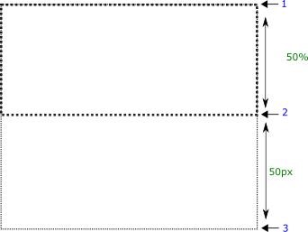
In the following demo, we have a grid that contains the grid rows. we have a grid item (green box) that occupies the second row of the grid i.e. from grid line 2 to 3. We'll specify different number of rows of different sizes in the grid.
Syntax
grid-template-rows : row-size1 row-size2 row-size3 ..
Property values
row1 row2Default
-
The grid consists of two rows each with 50% width. The item occupies the second row (50%).
-
- Try it
grid-template-rows: 50% 50%; row1 row2 row3
-
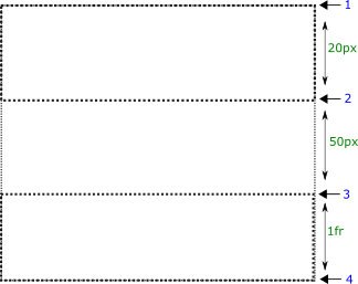
The grid consists of three rows with 20px, 50px, and 1fr sizes. 1fr means remaining fractional size. The item occupies the second row (50px). And the third row occupies the remaining space of the container.
And the grid item occupies the second row i.e. 50px area.
-
- Try it
grid-template-rows: 20px 50px 1fr; row1 row2 row3
-
The grid consists of three rows with 20px, 50px, and 1fr sizes. The item occupies the second row (50px).
-
- Try it
grid-template-rows: 20px 50px 1fr;
Applicable to
It applies to grid-containers.
Now, we'll see the grid-template-rows in more detail.
You might use any of the values as you use for the height or width properties i.e. min-content, max-content, fit-content, unit value, percentage value, or calc() function.
The selection of these values is very important in making a dynamic layout that fits the content completely and avoids any kind of overflow or extra space.